Case study: Loa loa prevalence mapping
library(readr)
loaloa <- read_csv("data/loaloa/loaloa.csv")
Exploratory analysis
Exercise 1
- Calculate the prevalence and empirical logit of prevalence and add them to the data frame as a new column, as we did yesterday for vaccine coverage in Haiti
loaloa %<>%
  mutate(p = infected/examined,
elogitp = log( (infected + 1/2)/(examined - infected + 0.5) ))- For each of the predictor variables (longitude, latitude, and mean, maximum, minimum and standard deviation of NDVI) show a scatterplot with a scatterplot smoother with the empirical logit of prevalence.
select(loaloa,
       elevation,
       latitude,
       longitude,
       contains("ndvi"),
       elogitp) %>%
  pivot_longer(cols = -elogitp, names_to = "key", values_to = "value") %>%
  ggplot(data=., aes(x=value, y=elogitp)) +
  geom_point() + geom_smooth(se=F) +
  facet_wrap(~key, scales = "free_x") + theme_bw()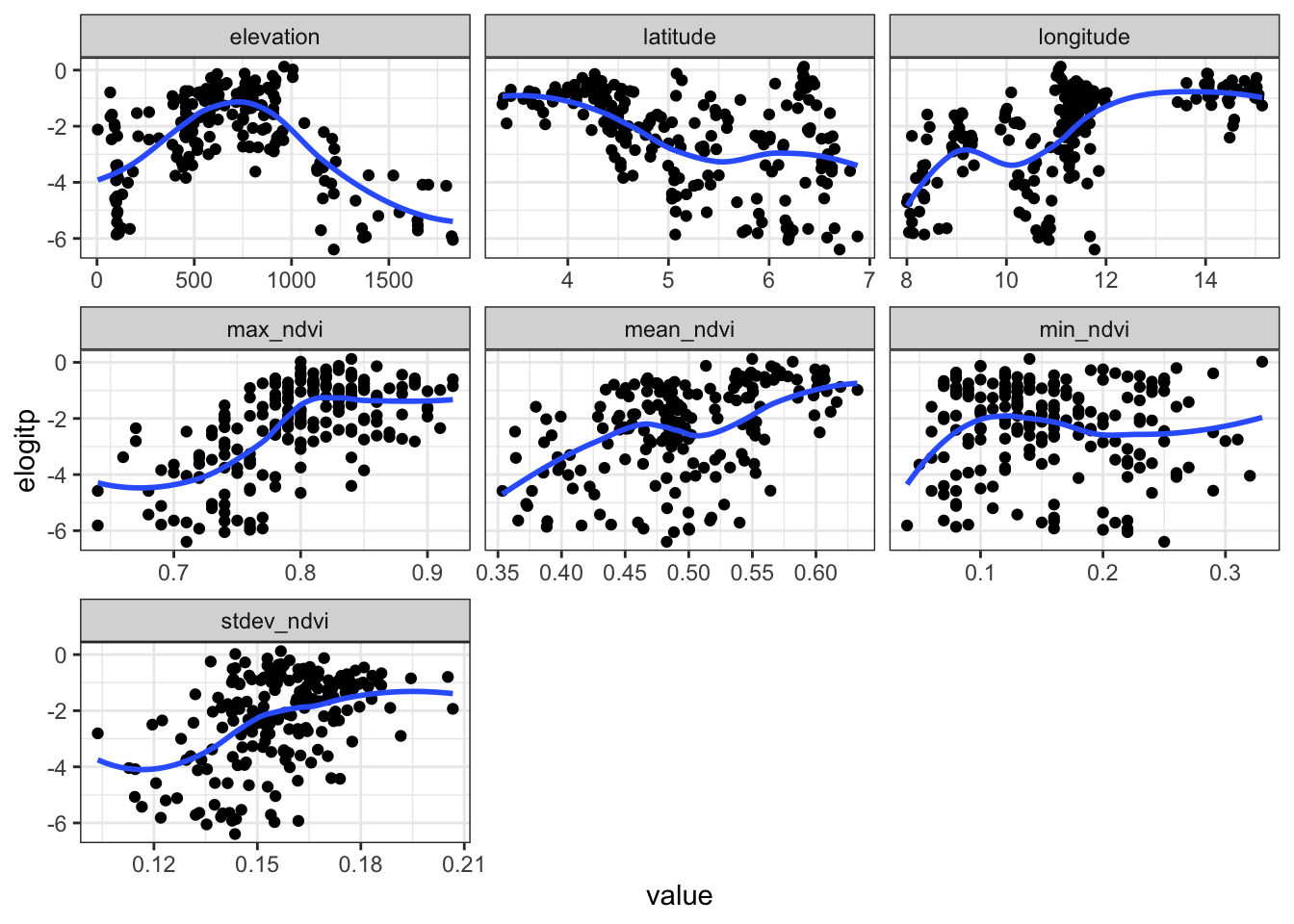
A solution
We want to visualise only the empirical logit against all of the named predictor variables. So let’s first focus on putting those in a data frame.
library(tidyr)

loaloa_exploratory_vars <- select(loaloa,
                                  elogitp, longitude, latitude, elevation,
                                  mean_ndvi, max_ndvi, min_ndvi, stdev_ndvi)

head(loaloa_exploratory_vars)
## # A tibble: 6 × 8
## elogitp longitude latitude elevation mean_ndvi max_ndvi min_ndvi stdev_ndvi
## <dbl> <dbl> <dbl> <dbl> <dbl> <dbl> <dbl> <dbl>
## 1 -5.78 8.04 5.74 108 0.439 0.69 0.09 0.139
## 2 -4.71 8.00 5.68 99 0.426 0.74 0.07 0.153
## 3 -2.72 8.91 5.35 783 0.491 0.79 0.12 0.165
## 4 -2.35 8.10 5.92 104 0.432 0.67 0.1 0.122
## 5 -3.85 8.18 5.10 109 0.415 0.85 0.1 0.166
## 6 -2.90 8.93 5.36 909 0.436 0.8 0.09 0.192For reshaping data from wide to long we can use the pivot_longer() command from tidyr. We specify the data frame we are operating on, the columns we want to pivot to long format, the new title of the column that contains the variable names (names_to) and values (values_to):
loaloa_exploratory_vars_long <-
  pivot_longer(loaloa_exploratory_vars,
               -elogitp,
               names_to = "xvar",
               values_to = "xvalue")

head(loaloa_exploratory_vars_long)
## # A tibble: 6 × 3
## elogitp xvar xvalue
## <dbl> <chr> <dbl>
## 1 -5.78 longitude 8.04
## 2 -5.78 latitude 5.74
## 3 -5.78 elevation 108
## 4 -5.78 mean_ndvi 0.439
## 5 -5.78 max_ndvi 0.69
## 6 -5.78 min_ndvi 0.09Model fitting
We now go back to the original loaloa data frame for the further analysis.
Exercise 2
- Fit a GAM that contains smooth functions of the predictor variables as described above except for latitude and longitude, ensure you use the
examinedcolumn as the weights (the denominator in the caluclation ofp)
library(mgcv)
library(broom)
loaloa_gam <- gam(data = loaloa, weights = examined,
                  p ~ s(elevation) + s(mean_ndvi) +
                    s(max_ndvi) + s(min_ndvi) +
s(stdev_ndvi), family = binomial())- Determine the AIC for the model
glance(loaloa_gam)## # A tibble: 1 × 9
## df logLik AIC BIC deviance df.residual nobs adj.r.squared npar
## <dbl> <dbl> <dbl> <dbl> <dbl> <dbl> <int> <dbl> <int>
## 1 43.5 -955. 1997. 2140. 1162. 154. 197 0.612 46- Are there any predictor variables which do not appear to be explaining variability?
Any smooth functions of variables that have a \(p\) value greater than 0.05 do not appear to explaining variability. For the model above, all \(p\) values are less than 0.05.
tidy(loaloa_gam)## # A tibble: 5 × 5
## term edf ref.df statistic p.value
## <chr> <dbl> <dbl> <dbl> <dbl>
## 1 s(elevation) 8.78 8.98 248. 0
## 2 s(mean_ndvi) 8.83 8.99 235. 0
## 3 s(max_ndvi) 7.34 8.12 85.6 0
## 4 s(min_ndvi) 8.65 8.96 63.2 0
## 5 s(stdev_ndvi) 8.86 8.99 73.5 0- Are there any predictor variables for which their smooth function gives unreasonable behaviour?
plot(loaloa_gam, pages = 1, scale = 0)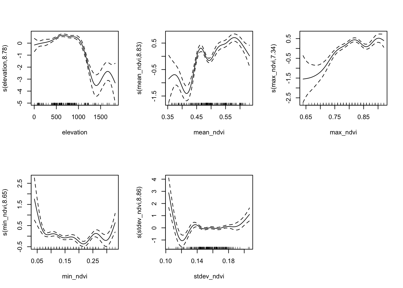
For the above model, we have asked for smooth functions of the explanatory variables that are based on whatever optimises a particular goodness of fit criterion rather than according to a principled specification of the relationships in the model.
There will no doubt be a complex interaction between all of the summary statistics of NDVI, but the function of elevation is worth studying. It may be the case that there is a threshold value of elevation below which loaloa incidence is not particularly sensitive to changes in elevation although there is a slight increase. Beyond an elevation of 1000 there is a sharp drop in the effect on prevalence before a bump with a wide confidence interval at the maximum values of elevation.
- Extract the residuals from the model and plot them spatially; does it appear that there may be a spatial relationship?
loaloa_sp_sf <- loaloa  %>%
  st_as_sf(coords = c("longitude", "latitude"), crs = 4326)

augment(loaloa_gam,
        type.predict = "link",
        type.residuals = "pearson") %>%
  {bind_cols(loaloa_sp_sf[,'geometry'],.)} %>%
  ggplot(data= .) +
  geom_sf(aes(fill = .resid), pch = 21) +
  scale_fill_gradient2() +
theme_bw() 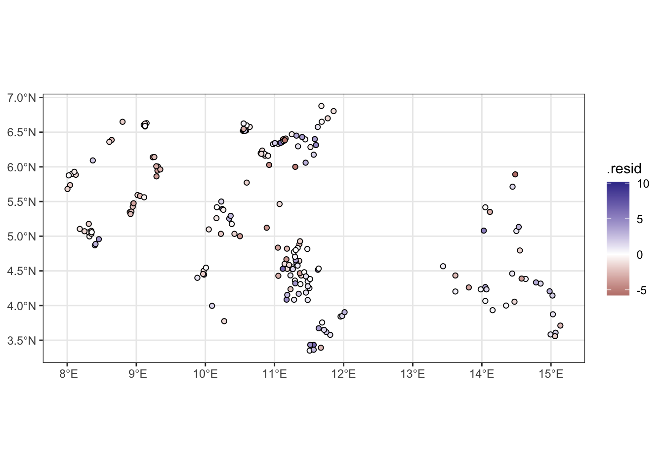
Exercise 3
- Reduce the complexity of the smooth functions in the model by using a lower rank smoother and re-fit. Hint:
s(x, k = ...)
loaloa_gam_low_k <- gam(data = loaloa, weights = examined,
                        p ~
                          s(elevation, k = 4) +
                          s(mean_ndvi, k = 4) +
                          s(max_ndvi,  k = 4) +
                          s(min_ndvi,  k = 4) +
                          s(stdev_ndvi,k = 4),
family = binomial())- Compare the AIC of this model to the AIC of the previous one. Which indicates a better fit?
glance(loaloa_gam)## # A tibble: 1 × 9
## df logLik AIC BIC deviance df.residual nobs adj.r.squared npar
## <dbl> <dbl> <dbl> <dbl> <dbl> <dbl> <int> <dbl> <int>
## 1 43.5 -955. 1997. 2140. 1162. 154. 197 0.612 46glance(loaloa_gam_low_k)## # A tibble: 1 × 9
## df logLik AIC BIC deviance df.residual nobs adj.r.squared npar
## <dbl> <dbl> <dbl> <dbl> <dbl> <dbl> <int> <dbl> <int>
## 1 14.0 -1126. 2281. 2327. 1505. 183. 197 0.581 16We see that the more complex smoother has a lower AIC and hence conclude it’s a better fitting model. If the less complex model were indeed a better fitting model, the smoothness penalty on the splines would have smoothed the functions of the explanatory variables to be the same as the low-rank smooths
- Plot the smooths with reduced complexity; do they still exhibit unrealistic behaviour?
plot(loaloa_gam_low_k, pages = 1, scale = 0)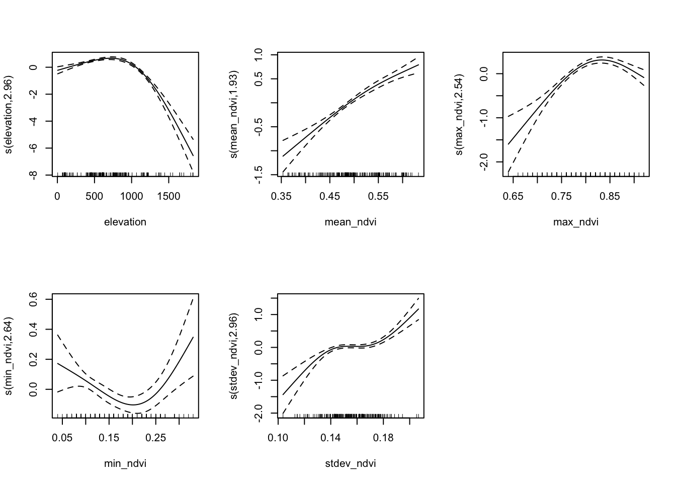
Exercise 4
- Convert the
loaloadata to a simple feature (coordinate reference system is WGS84) and project to a planar system with coordinates in Eastings (X) and Northings (Y). Hint: the relevant epsg code to use is 32633
loaloa_sp_sf <- loaloa  %>%
  st_as_sf(coords = c("longitude", "latitude"), crs = 4326) %>%
  st_transform(crs = "+init=epsg:32633 +units=km")

# add coordinates
loaloa_sp_sf <- loaloa_sp_sf %>%
  st_coordinates %>%
  data.frame %>%
bind_cols(loaloa_sp_sf, .)- Add a the
XandYas variables to your data set. Then add a Gaussian process term forXandYto your earlier model with low rank smooths.
loaloa_gam_gp <- gam(data = loaloa_sp_sf, weights = examined,
                     p ~
                       s(elevation, k = 4) +
                       s(mean_ndvi, k = 4) +
                       s(max_ndvi,  k = 4) +
                       s(min_ndvi,  k = 4) +
                       s(stdev_ndvi,k = 4) +
                       s(X, Y, bs = "gp"),
family = binomial())- Compare the AIC of this model to the AIC of the previous ones. Which indicates a better fit?
summary(loaloa_gam_gp)##
## Family: binomial
## Link function: logit
##
## Formula:
## p ~ s(elevation, k = 4) + s(mean_ndvi, k = 4) + s(max_ndvi, k = 4) +
## s(min_ndvi, k = 4) + s(stdev_ndvi, k = 4) + s(X, Y, bs = "gp")
##
## Parametric coefficients:
## Estimate Std. Error z value Pr(>|z|)
## (Intercept) -2.32005 0.03915 -59.25 <2e-16 ***
## ---
## Signif. codes: 0 '***' 0.001 '**' 0.01 '*' 0.05 '.' 0.1 ' ' 1
##
## Approximate significance of smooth terms:
## edf Ref.df Chi.sq p-value
## s(elevation) 2.860 2.986 56.90 < 2e-16 ***
## s(mean_ndvi) 2.962 2.998 21.57 6.22e-05 ***
## s(max_ndvi) 2.793 2.965 40.91 < 2e-16 ***
## s(min_ndvi) 2.937 2.997 53.57 < 2e-16 ***
## s(stdev_ndvi) 2.952 2.998 45.67 < 2e-16 ***
## s(X,Y) 30.441 31.232 619.86 < 2e-16 ***
## ---
## Signif. codes: 0 '***' 0.001 '**' 0.01 '*' 0.05 '.' 0.1 ' ' 1
##
## R-sq.(adj) = 0.765 Deviance explained = 82.5%
## UBRE = 3.2067 Scale est. = 1 n = 197glance(loaloa_gam_gp)## # A tibble: 1 × 9
## df logLik AIC BIC deviance df.residual nobs adj.r.squared npar
## <dbl> <dbl> <dbl> <dbl> <dbl> <dbl> <int> <dbl> <int>
## 1 45.9 -743. 1577. 1728. 737. 151. 197 0.765 48Adding the Gaussian process smooth results in a lower AIC, indicating that adding the GP, with its 30.4413256 effective degrees of freedom, results in a better fitting model.
plot(loaloa_gam_gp,
     pages = 1,
     scale = 0)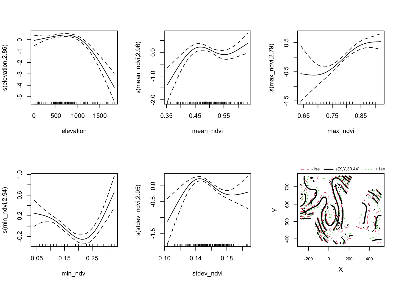
A plot of the residuals:
augment(loaloa_gam_gp,
        type.predict = "link",
        type.residuals = "pearson") %>%
  {bind_cols(loaloa_sp_sf[,'geometry'],.)} %>%
  ggplot(data= .) +
  geom_sf(aes(fill = .resid), pch = 21) +
  scale_fill_gradient2(name = "Residuals") +
theme_bw() 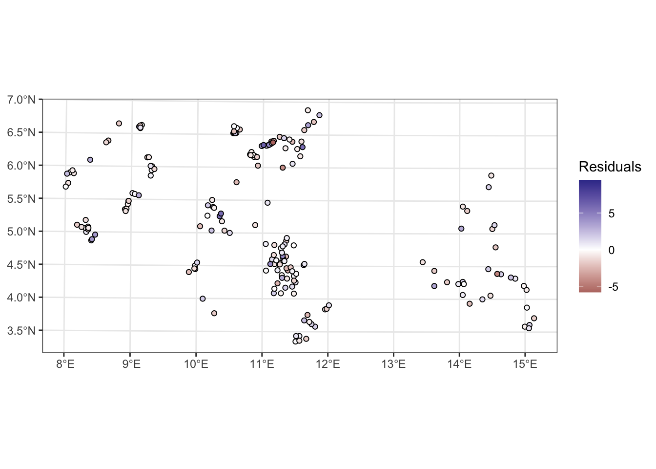
Prediction and visualisation
Exercise 5
- Create the data frame containing the predictor values at the locations within the observed data region and within Cameroon
- Extract the fitted spatial random effect (Gaussian process)
- Calculate the predictions and plot them
library(terra)
ndvi2018   <- terra::rast("data/loaloa/ndvi2018.grd")
elevation  <- terra::rast("data/loaloa/elevation.tif")
Africa     <- st_read("data/loaloa/Africa.shp", quiet = TRUE)
ndvi2018 <- project(ndvi2018, crs(loaloa_sp_sf))
# Calculate rasters for the maximum , minimum, mean and standard deviation
max_ndvi <- app(ndvi2018, max, na.rm = T)
min_ndvi <- app(ndvi2018, min, na.rm = T)
mean_ndvi <- app(ndvi2018, mean, na.rm = T)
stdev_ndvi <- app(ndvi2018, sd, na.rm = T)
# Load the raster containing the elevation
elevation <- project(elevation, crs(loaloa_sp_sf))
# Aggregate by a factor of 5 to convert from 1km x 1km to 5km x 5km resolution
# by default this will calculate the mean value across pixels
max_ndvi_5 <- aggregate(max_ndvi, fact = 5)
min_ndvi_5 <- aggregate(min_ndvi, fact = 5)
mean_ndvi_5 <- aggregate(mean_ndvi, fact = 5)
stdev_ndvi_5 <- aggregate(stdev_ndvi, fact = 5)
elevation_5 <- aggregate(elevation, fact = 5)
# make a grid that covers the region of interest
# this will later become our predicted risk map raster
grid_5km <- st_make_grid(loaloa_sp_sf,
cellsize = 5,
what = "centers")
# we only want to consider the part of the grid inside Cameroon
cameroon <- Africa %>%
dplyr::filter(COUNTRY == "Cameroon") %>%
st_transform(crs = crs(loaloa_sp_sf))
pred_coord <- st_intersection(x = grid_5km, y = cameroon)
# extract the value of each of our rasters at the relevant grid locations
# here we are scaling by 10000 to put them on the same scale as the values
# in the data frame
pred_5 <- st_coordinates(pred_coord)
X_pred <- data.frame(
elevation = extract(elevation_5,
pred_5)/10000,
max_ndvi = extract(max_ndvi_5,
pred_5)/10000,
min_ndvi = extract(min_ndvi_5,
pred_5)/10000,
mean_ndvi = extract(mean_ndvi_5,
pred_5)/10000,
stdev_ndvi = extract(stdev_ndvi_5,
pred_5)/10000
)
# manually modify column names to match original names
colnames(X_pred) = c("elevation", "max_ndvi", "min_ndvi", "mean_ndvi", "stdev_ndvi")
loaloa_sp_sf_pred <-
pred_coord %>% # start with the prediction location sf
st_coordinates %>% # extract the coordinates
data.frame %>% # convert to a data frame
cbind(., X_pred) %>% # bind the coordinates and values of the rasters
na.omit(.) # drop any rows with missing values (outside our raster of interest)Now we extract the values of the spatial random effect. The predict() function, when applied to a GAM, gives us the ability to extract the predictions we want (on either the response scale or the link scale), or the partial effects of the explanatory variables on the linear predictor (link scale predictions).
We will make the predictions at the prediction locations, convert them to a special type of data frame called a tibble and then bind them by column to the prediction coordinates
loaloa_sp_sf_pred_sXY <-
  loaloa_sp_sf_pred %>%
  bind_cols(predict.gam(object = loaloa_gam_gp,
                        newdata = loaloa_sp_sf_pred,
                        type = "terms",
                        terms = "s(X,Y)",
                        se.fit = F) %>%
              as_tibble) %>%
  select(X,Y, `s(X,Y)`)

head(loaloa_sp_sf_pred_sXY)
## X Y s(X,Y)
## 1 -9.0525866 373.4716 2.128472
## 2 -4.0525866 373.4716 2.024921
## 3 0.9474134 373.4716 1.927929
## 4 5.9474134 373.4716 1.837178
## 5 10.9474134 373.4716 1.752290
## 6 15.9474134 373.4716 1.672829# load in the scales package for muted colour schemes
library(scales)
ggplot(data = loaloa_sp_sf_pred_sXY,
aes(x=X, y=Y)) +
geom_raster(aes(fill = `s(X,Y)`)) +
coord_equal() +
scale_fill_gradient2(low = muted("blue"),
high = muted("red"),
limits = c(-5, NA),
na.value = muted("blue")) +
theme_bw() +
ylab("Northings") + xlab("Eastings") +
theme(legend.position = "bottom") +
ggtitle("Fitted spatial effect")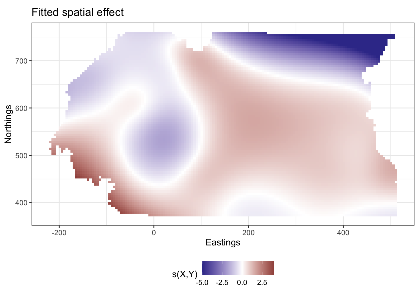
loaloa_sp_sf_pred %>%
  bind_cols(predict.gam(object = loaloa_gam_gp,
                        newdata = .,
                        type = "response",
                        se.fit = F) %>%
              tibble(value = .)) %>%
  na.omit %>%
  ggplot(data = ., aes(x=X, y=Y)) +
  geom_raster(aes(fill = value)) +
  coord_equal() +
  theme_bw() +
  ylab("Northings")  + xlab("Eastings") +
  scale_fill_viridis_c(limits = c(0,1),
                       name = "Prevalence of Loa loa") +
  theme(legend.position = "bottom") +
  ggtitle("Predicted prevalence of Loa loa")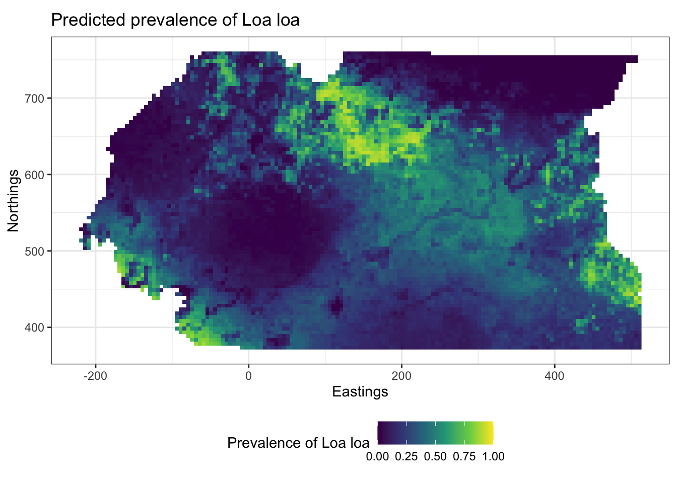
Point patterns
Generating a point pattern
Exercise 1
To estimate the intensities for the point patterns of cases and controls in Finger et al. (2018) we need \((x,y)\) pairs of observations.
- Load in the cholera data and the window data and combine them into a point pattern dataset object using the
ppp()function. Try the help file (?ppp) if unsure how to use this function.
cholera <- read_csv("data/cholera/cholera.csv")

cholera_window <- read_rds("data/cholera/window.rds")

cholera_ppp <-
  ppp(x      = cholera$X,
      y      = cholera$Y,
      marks  = factor(cholera$case,
                      levels = c("case",
                                 "control")),
window = cholera_window)| X | Y | case | casen |
|---|---|---|---|
| 15.09224 | 12.13164 | control | 0 |
| 15.08575 | 12.11281 | control | 0 |
| 15.08511 | 12.07600 | control | 0 |
| 15.06814 | 12.11220 | case | 1 |
| 15.10735 | 12.09637 | case | 1 |
| 15.05894 | 12.13156 | control | 0 |
| 15.08828 | 12.09589 | case | 1 |
| 14.97423 | 12.12659 | control | 0 |
| 15.13104 | 12.11186 | case | 1 |
| 15.08824 | 12.07600 | case | 1 |
Kernel smoothing of point patterns
Exercise 2
- Choose a kernel bandwidth, \(h_0\), between 0.005 and 0.5 and assign it to a new object
h0 - Load the spatstat package and calculate the spatially-varying probability of cases and controls (separately)
library(spatstat)
# chosing a kernel bandwidth
h0 <- 0.02

# calculate the bivariate smoothed density separately for cases and controls by changing the casecontrol argument to FALSE
cc_smoothed <- relrisk(cholera_ppp,
                       sigma = h0,
                       casecontrol = FALSE)
Calculating relative risk
Exercise 3
- Convert the
$velements in each of the smoothed densities to data frames. These are stored in lists which can be inspected using thestr()function and accessed using the$sign. Ensure that you transpose the matrix of$vvalues using thet()function before converting them to vectors. - Join these data frames together and calculate the relative risk by taking the ratio of the
caseandcontrolcolumns.
\[ RR(\boldsymbol{s}_i) = \frac{\lambda_{\mathrm{case}}(\boldsymbol{s}_i)}{\lambda_{\mathrm{control}}(\boldsymbol{s}_i)} \]
- Make a plot of the relative risk for your chosen value of the smoothing bandwidth \(h\)
# create a dataframe with the x and y coordinates of the pixels
pix_coords <- expand.grid(x = cc_smoothed$case$xcol, y = cc_smoothed$case$yrow)

# convert the matrix of pixels into a vector of values
# not that the values are stored in a list of lists and we have to use the "$" to access these
# to see what elements are accessible in a list use the str() function
str(cc_smoothed)
## List of 2
## $ case :List of 10
## ..$ v : num [1:128, 1:128] NA NA NA NA NA NA NA NA NA NA ...
## ..$ dim : int [1:2] 128 128
## ..$ xrange: num [1:2] 14.9 15.2
## ..$ yrange: num [1:2] 12 12.2
## ..$ xstep : num 0.00184
## ..$ ystep : num 0.00129
## ..$ xcol : num [1:128] 14.9 14.9 14.9 14.9 14.9 ...
## ..$ yrow : num [1:128] 12 12 12 12 12.1 ...
## ..$ type : chr "real"
## ..$ units :List of 3
## .. ..$ singular : chr "unit"
## .. ..$ plural : chr "units"
## .. ..$ multiplier: num 1
## .. ..- attr(*, "class")= chr "unitname"
## ..- attr(*, "class")= chr "im"
## $ control:List of 10
## ..$ v : num [1:128, 1:128] NA NA NA NA NA NA NA NA NA NA ...
## ..$ dim : int [1:2] 128 128
## ..$ xrange: num [1:2] 14.9 15.2
## ..$ yrange: num [1:2] 12 12.2
## ..$ xstep : num 0.00184
## ..$ ystep : num 0.00129
## ..$ xcol : num [1:128] 14.9 14.9 14.9 14.9 14.9 ...
## ..$ yrow : num [1:128] 12 12 12 12 12.1 ...
## ..$ type : chr "real"
## ..$ units :List of 3
## .. ..$ singular : chr "unit"
## .. ..$ plural : chr "units"
## .. ..$ multiplier: num 1
## .. ..- attr(*, "class")= chr "unitname"
## ..- attr(*, "class")= chr "im"
## - attr(*, "class")= chr [1:5] "imlist" "solist" "anylist" "listof" ...
## - attr(*, "sigma")= num 0.02str(cc_smoothed$case)## List of 10
## $ v : num [1:128, 1:128] NA NA NA NA NA NA NA NA NA NA ...
## $ dim : int [1:2] 128 128
## $ xrange: num [1:2] 14.9 15.2
## $ yrange: num [1:2] 12 12.2
## $ xstep : num 0.00184
## $ ystep : num 0.00129
## $ xcol : num [1:128] 14.9 14.9 14.9 14.9 14.9 ...
## $ yrow : num [1:128] 12 12 12 12 12.1 ...
## $ type : chr "real"
## $ units :List of 3
## ..$ singular : chr "unit"
## ..$ plural : chr "units"
## ..$ multiplier: num 1
## ..- attr(*, "class")= chr "unitname"
## - attr(*, "class")= chr "im"case_vec <- cc_smoothed$case$v %>%
t() %>% # we need to transpose the matrix to make the columns rows and the rows columns
as.vector()
control_vec <- cc_smoothed$control$v %>%
t() %>%
as.vector()
# bind the coordinates and the vector values together
case_smoothed_df <- bind_cols(pix_coords,
case = case_vec)
control_smoothed_df <- bind_cols(pix_coords,
control = control_vec)
# join the case and control values and calculate relative risk
smoothed_df <- inner_join(case_smoothed_df,
control_smoothed_df) %>%
mutate(rr = case/control)
# plot a raster of relative risk
ggplot(data = smoothed_df,
aes(x=x,y=y)) +
geom_raster(aes(fill = rr)) +
scale_fill_gradient2(trans = "log2",
midpoint = 0,
name = "Relative risk",
low = "blue",
high = "red",
labels = MASS::fractions) +
theme_bw() +
xlab("Longitude") + ylab("Latitude") +
coord_equal() 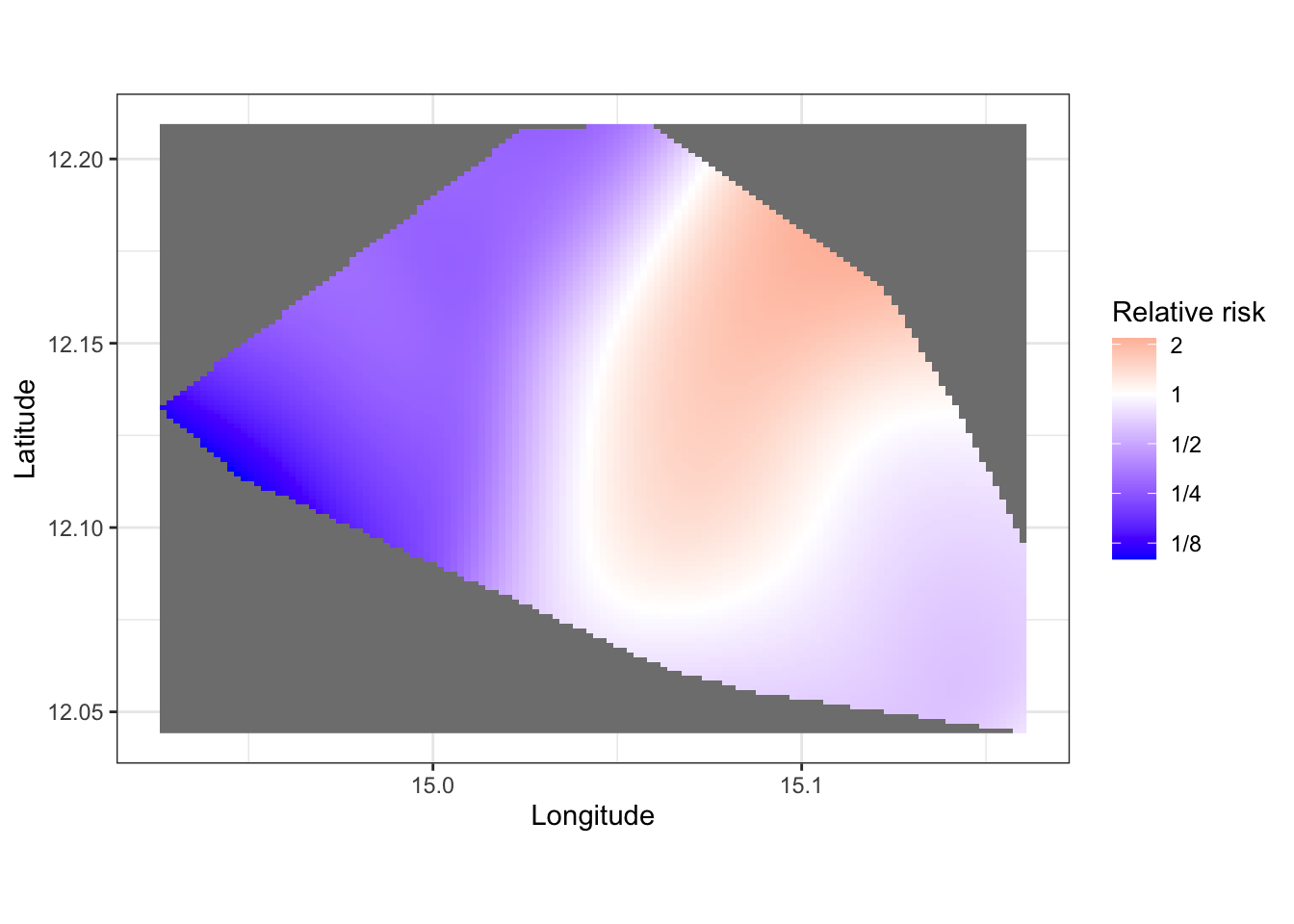
- Discuss with your colleagues the differences in your plots arising from different choices of \(h\). Compare your plots to the data, do they reasonably approximate the patterns found in the scatterplot of case and controls?
Adaptive kernel smoothing
Exercise 4
- Use the
relrisk()function in the statspat() package to implement automated bandwidth smoothing estimation by cross validation using thebw.digglealgorithm and estimate relative risk.
cholera_risk <- relrisk(cholera_ppp,
                       casecontrol = FALSE,
                       sigma = bw.diggle,
relative = FALSE)- Using the same approach as before convert the
$velement of the relative risk object to a data frame and plot the relative risk. Note you may need to restrict the values of relative risk to plausible upper and lower limits for visualisation.
# extract a vector of values for cases and controls
rr_vec_case <- cholera_risk$case$v %>%
  t() %>%
  as.vector()

rr_vec_control <- cholera_risk$control$v %>%
  t() %>%
  as.vector()

# insert into a dataframe
rr_smoothed_df <- bind_cols(pix_coords,
                            rr = (rr_vec_case + 0.0001) / (rr_vec_control + 0.0001)) # zero inflate probabilities to avoid infinite RR

# cap values of RR for visualisation purposes
rr_smoothed_df$rr <- rr_smoothed_df$rr %>%
                           replace(. < 0.1, 0.1) %>%
                           replace(. > 5, 5)


# plotting
ggplot(data = rr_smoothed_df,
         aes(x=x,y=y)) +
  geom_raster(aes(fill = rr)) +
  scale_fill_gradient2(trans = "log2",
                       midpoint = 0,
                       name = "Relative risk",
                       low = "blue",
                       high = "red",
                       labels = MASS::fractions) +
  theme_bw() +
  xlab("Longitude") + ylab("Latitude") +
  coord_equal()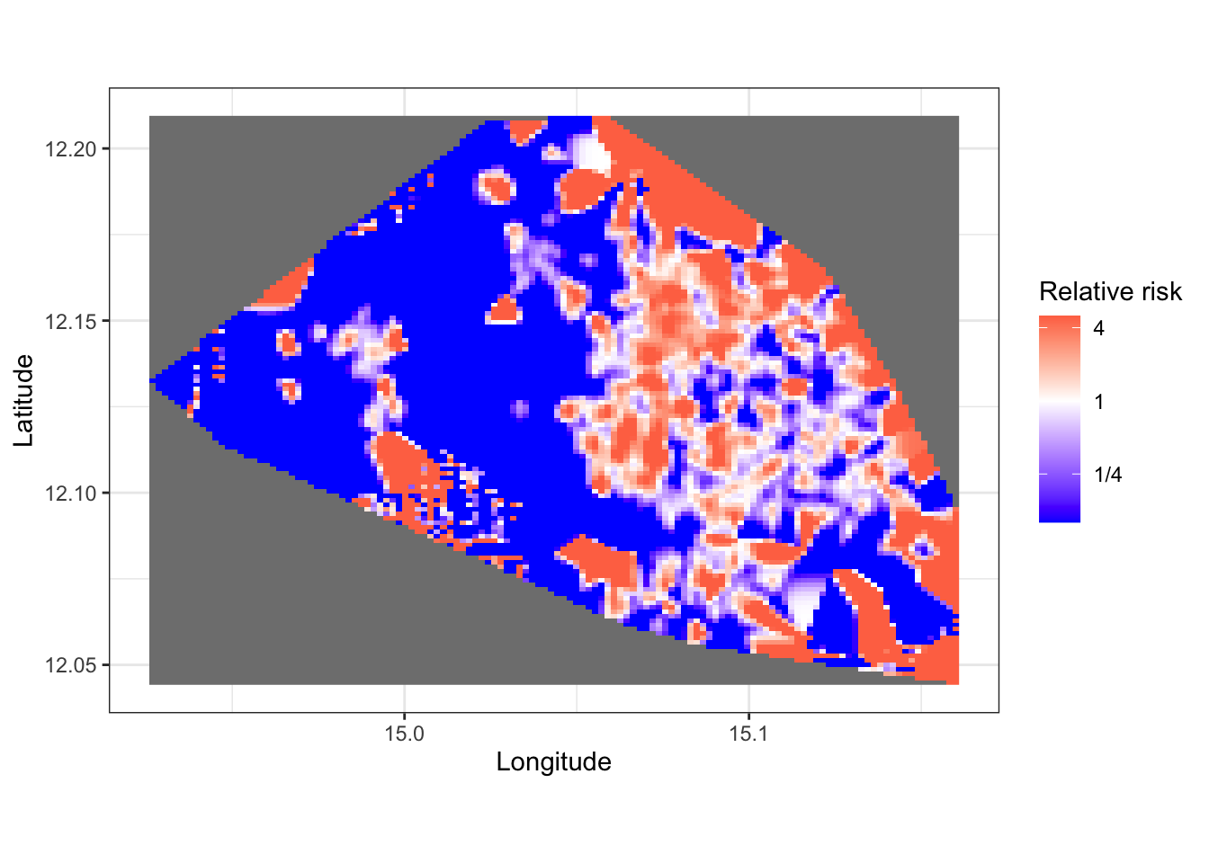
- Compare your automatically selected smoothed relative risk plot to your fixed \(h\) plot from before. What are the similarities and differences?
The automatic smoothing results in a spatial relative risk estimate that is not as smooth as the manually chosen one above (although your value of h0 may give different results). The smoothing via the spatstat package’s relrisk() function using the bw.diggle algorithm, is based on optimising a goodness of fit criterion whe evaluated on a set of data that is not used to fit the model and is more appropriate than taking the ratio of two manually smoothed surfaces, particularly if the smoothness of the processes causing our two point patterns (in this situation, cases and controls for Cholera) are different.
As in all the models we have looked at, the choices of amount of smoothness is an important one that reflects the beliefs we hold about the properties of the processes driving the variability in our models. Hence we should always approach our modelling with a degree of caution, acknowledging the limitations of our expertise, and with checks on our models to determine whether or not the results they give are meaningful and accurate.
“Essentially, all models are wrong but some models are useful” - George E. P. Box
Point process models
Exercise 5
If you are finished and looking for the next challenge, investigate the spatstat::ppm() function, which fits models to spatial point processes. Given that the pattern varies with marks as well as x and y, consider fitting a polynomial in \(x\) and \(y\) that varies with marks as well.
You may wish to investigate appropriate interaction settings based on whether or not there is clustering or repulsion for cholera cases.
If we had predictor variables that varied spatially in this region, such as distance to rivers, population density, socio-economic status, we could add these to the spatial trend. Point process models are outside the scope of this module, however. You may wish to look at Finger et al. (2018)’s S1 text in the supporting information and look at the source for the rainfall data and incorporate it into the model.