Objectives
In this session we will show how to perform a spatial analysis of point data, considering the relationship between observations which have been observed at points, either as realisations of a stochastic process or as point-measurements of continuous spatial phenomena.
This practical will cover:
- Manipulation of spatial data sets within an R framework
- Converting observed spatial locations to a point pattern
- Kernel smoothing of a spatial point patten
- Generate spatial predictions.
Case study: Loa loa prevalence mapping
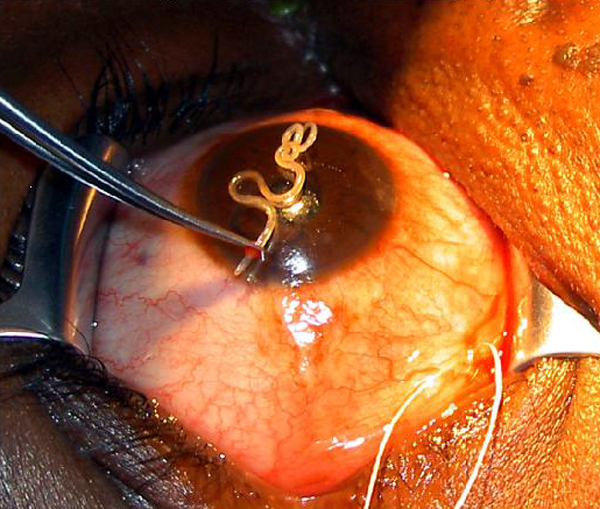
The data for this example relate to a study of the prevalence of Loa loa (eyeworm) in a series of surveys undertaken in 197 villages in Cameroon and southern Nigeria; see Diggle et al. (2007) for more details. The figure below shows the Loa loa life cycle (left) and the actual parasite in the eye (right).

A codebook is provided below, together with a map that displays the point locations.
| Variable | Label |
|---|---|
| row | row id 1 to 197 |
| villcode | village id |
| longitude | longitude in degrees |
| latitude | latitude in degrees |
| examined | number of people tested |
| infected | number of positive test results |
| elevation | height above sea-level in metres |
| mean_ndvi | mean of all NDVI values recorded at village location, 1999-2001 |
| max_ndvi | maximum of all NDVI values recorded at village location, 1999-2001 |
| min_ndvi | minimum of all NDVI values recorded at village location, 1999-2001 |
| stdev_ndvi | standard deviation of all NDVI values recorded at village location, 1999-2001 |
library(readr)
loaloa <- read_csv("data/loaloa/loaloa.csv")
Exploratory analysis
We wish to understand the relationship between Loa loa prevalence and each of the potential explanatory variables.
Exercise 1
- Calculate the prevalence and empirical logit of prevalence and add them to the data frame as a new column, as we did yesterday for vaccine coverage in Haiti
- For each of the predictor variables (longitude, latitude, and mean, maximum, minimum and standard deviation of NDVI) show a scatterplot with a scatterplot smoother with the empirical logit of prevalence.
Model fitting
We now go back to the original loaloa data frame for the further analysis.
Exercise 2
- Fit a GAM that contains smooth functions of the predictor variables as described above except for latitude and longitude, ensure you use the
examinedcolumn as the weights (the denominator in the calculation ofp) - Determine the AIC for the model
- Are there any predictor variables which do not appear to be explaining variability?
- Are there any predictor variables for which their smooth function gives unreasonable behaviour?
- Extract the residuals from the model and plot them spatially; does it appear that there may be a spatial relationship?
library(mgcv)
loaloa_gam <- gam(data = loaloa, weights = examined,
                  p ~ ..., family = binomial())
Exercise 3
- Reduce the complexity of the smooth functions in the model by using a lower rank smoother and re-fit. Hint:
s(x, k = ...) - Compare the AIC of this model to the AIC of the previous one. Which indicates a better fit?
- Plot the smooths with reduced complexity; do they still exhibit unrealistic behaviour?
Exercise 4
- Convert the
loaloadata to a simple feature (coordinate reference system is WGS84) and project to a planar system with coordinates in Eastings (X) and Northings (Y). Hint: the relevant epsg code to use is 32633 - Add a the
XandYas variables to your data set. Then add a Gaussian process term forXandYto your earlier model with low rank smooths. - Compare the AIC of this model to the AIC of the previous ones. Which indicates a better fit?
Prediction and visualisation
Exercise 5
- Create a data frame containing the predictor values at the locations within the observed data region and within Cameroon (hint: you’ll likely need to crop a map)
- Extract the fitted spatial effect (Gaussian process) term from the model at these prediction locations
- Calculate the predictions and plot them
library(terra)
ndvi2018 <- rast("data/loaloa/ndvi2018.grd")

ndvi2018 <- project(ndvi2018, crs(loaloa_sp_sf))

# Calculate rasters for the maximum , minimum, mean and standard deviation
max_ndvi   <- app(ndvi2018, max,  na.rm = T)
min_ndvi   <- ...
mean_ndvi  <- ...
stdev_ndvi <- ...

# Load the raster containing the elevation and project it
elevation  <- rast("data/loaloa/elevation.tif")
elevation  <- project(elevation, crs(loaloa_sp_sf))

# Aggregate by a factor of 5 to convert from 1km x 1km to 5km x 5km resolution
# by default this will calculate the mean value across pixels
max_ndvi_5   <- terra::aggregate(max_ndvi,   fact = 5)
min_ndvi_5   <- ...
mean_ndvi_5  <- ...
stdev_ndvi_5 <- ...
elevation_5  <- ...

# make a grid that covers the region of interest
# this will later become our predicted risk map raster
grid_5km   <- st_make_grid(loaloa_sp_sf,
                           cellsize = 5,
                           what = "centers")

# we only want to consider the part of the grid inside Cameroon
cameroon <- st_read("data/loaloa/Africa.shp",
                    quiet = TRUE ) %>%
  dplyr::filter(COUNTRY == "Cameroon") %>%
  st_transform(crs = crs(loaloa_sp_sf))

# make an sf that crops the 5km grid to the Cameroon boundary
pred_coord <- st_intersection(...)

# extract the value of each of our rasters at the relevant grid locations
# here we are scaling by 1/10000 returns them from integers to decimals at the right scale

pred_5 <- st_coordinates(pred_coord)
X_pred <- tibble(
    elevation  = terra::extract(elevation_5,
                                 pred_5)/10000,
    max_ndvi   = ...,
    min_ndvi   = ...,
    mean_ndvi  = ...,
    stdev_ndvi = ...
    )
Make a data frame that combines the coordinates from pred_coord with the values in X_pred at these coordinates.
loaloa_sp_sf_pred <-
  ...
  cbind(., X_pred) %>% # bind the coordinates and values of the rasters
  na.omit(.)           # drop any rows with missing values (outside our raster of interest)
Now we extract the values of the spatial random effect. The predict() function, when applied to a GAM, gives us the ability to extract the predictions we want (on either the response scale (type='response') or the link scale (type='link')), or the partial effects of the explanatory variables (type='terms') on the linear predictor.
We will make the predictions at the prediction locations, convert them to a special type of data frame called a tibble and then bind them by column to the prediction coordinates
loaloa_sp_sf_pred_sXY <-
  loaloa_sp_sf_pred %>%
  bind_cols(predict.gam(...
                        type = "terms",
                        terms = "s(X,Y)",
                        se.fit = F) %>%
              as_tibble) %>%
  dplyr::select(X,Y, `s(X,Y)`)
Extension exercises
Alternative model
Exercise: Replace the splines with linear terms in the GAM. How does the AIC change?
Exercise: Do you end up with a different prediction surface? Describe any differences you see.
Exercise: Do you end up with a different spatial random effect term? Describe any differences you see.
Exercise: How does your interpretation of the covariate effects change?
Point patterns
We now wish to consider the relative risk of Cholera infection in Chad as reported in Finger et al. (2018). At this point, it might be worth clearing the workspace and restarting R to ensure that we have a nice, clean environment for this separate analysis.
Generating a point pattern
Exercise 1
To estimate the intensities for the point patterns of cases and controls we need \((x,y)\) pairs of observations.
- Load in the cholera data and the window data and combine them into a point pattern dataset object using the
ppp()function. Try the help file (?ppp) if unsure how to use this function.
Kernel smoothing of point patterns
Using the functions in the spatstat package, we can conduct bivariate kernel smoothing of the case and control point patterns. When we constructed the point pattern earlier, it was constructed as a marked point pattern with two levels (case, control). We can conduct kernel smoothing separately for case and control points by setting the argument casecontrol=FALSE within the relrisk() function.
Exercise 2
- Choose a kernel bandwidth, \(h_0\), between 0.005 and 0.5 and assign it to a new object
h0 - Load the spatstat package and calculate the spatially-varying probability of cases and controls (separately)
Calculating relative risk
Exercise 3
- Convert the
$velements in each of the smoothed densities to data frames. These are stored in lists which can be inspected using thestr()function and accessed using the$sign. Ensure that you transpose the matrix of$vvalues using thet()function before converting them to vectors. - Join these data frames together and calculate the relative risk by taking the ratio of the
caseandcontrolcolumns.
\[ RR(\boldsymbol{s}_i) = \frac{\lambda_{\mathrm{case}}(\boldsymbol{s}_i)}{\lambda_{\mathrm{control}}(\boldsymbol{s}_i)} \]
- Make a plot of the relative risk for your chosen value of the smoothing bandwidth \(h\)
- Discuss with your colleagues the differences in your plots arising from different choices of \(h\). Compare your plots to the data, do they reasonably approximate the patterns found in the scatterplot of case and controls?
Adaptive kernel smoothing
Rather than estimating the density functions independently, but with the same bandwidth, we can estimate the optimal value of \(h\) using a cross validation algorithm. For us, this means that we are considering all the data at the same time and the choice of \(h\) is automatic based on the algorithm ensuring the smoothing parameter is appropriate to the spatial scale of the data.
Exercise 4
- Use the
relrisk()function in the statspat() package to implement automated bandwidth smoothing estimation by cross validation using thebw.digglealgorithm and estimate relative risk. - Using the same approach as before convert the
$velement of the relative risk object to a data frame and plot the relative risk. Note you may need to restrict the values of relative risk to plausible upper and lower limits for visualisation. - Compare your adaptively smoothed relative risk plot to your fixed \(h\) plot from before. What are the similarities and differences?
Point process models
Extension Exercise 5
If you are finished and looking for the next challenge, investigate the spatstat::ppm() function, which fits models to spatial point processes. Given that the pattern varies with marks as well as x and y, consider fitting a polynomial in \(x\) and \(y\) that varies with marks as well.
You may wish to investigate appropriate interaction settings based on whether or not there is clustering or repulsion for cholera cases.
If we had predictor variables that varied spatially in this region, such as distance to rivers, population density, socio-economic status, we could add these to the spatial trend. Point process models are outside the scope of this module, however. You may wish to look at Finger et al. (2018)’s S1 text in the supporting information and look at the source for the rainfall data and incorporate it into the model.