Packages
# Load the packages needed for this practical
if (!require("pacman")) install.packages("pacman")
pkgs = c("sf",        # for simple features representing spatial data
         "mgcv",      # for fitting models
         "tidyverse") # for ggplot2, tidyr, readr, dplyr, %>% pipe
pacman::p_load(pkgs, character.only = T)
Don’t forget to define the functions that provide the Queen and Rook adjacency rules.
st_queen <- function(a, b = a,...) st_relate(a, b, pattern = "F***T****", ...)
st_rook  <- function(a, b = a,...) st_relate(a, b, pattern = "F***1****", ...)
Case study - Haiti vaccine coverage
The functions in sf allow us to define neighbourhood structures and convert these to spatial weights matrices in R. The spatial weights matrix will be used later for regression modelling and assessing spatial correlation.
Exploratory analysis
Exercise 1
- Load the
adm2.geojsonfile and use thestringsAsFactors = Foption - Create a spatial weights matrix using
st_queen() - Look at the structure of the spatial weights matrix either by printing or Viewing it. Hint: you can add 0 to the matrix to convert from logical to numeric entries
library(sf)
sf_use_s2(FALSE)
adm2 <- st_read('data/haiti/adm2.geojson',
                stringsAsFactors = F,
                quiet = TRUE)

# create a neighbours object
adm2_nb <- st_queen(adm2, sparse=FALSE)
We can show the adjacency matrix by converting from R’s default matrix class to the Matrix class of the Matrix package.
library(Matrix)
adm2_nb %>%
  Matrix %>%
  image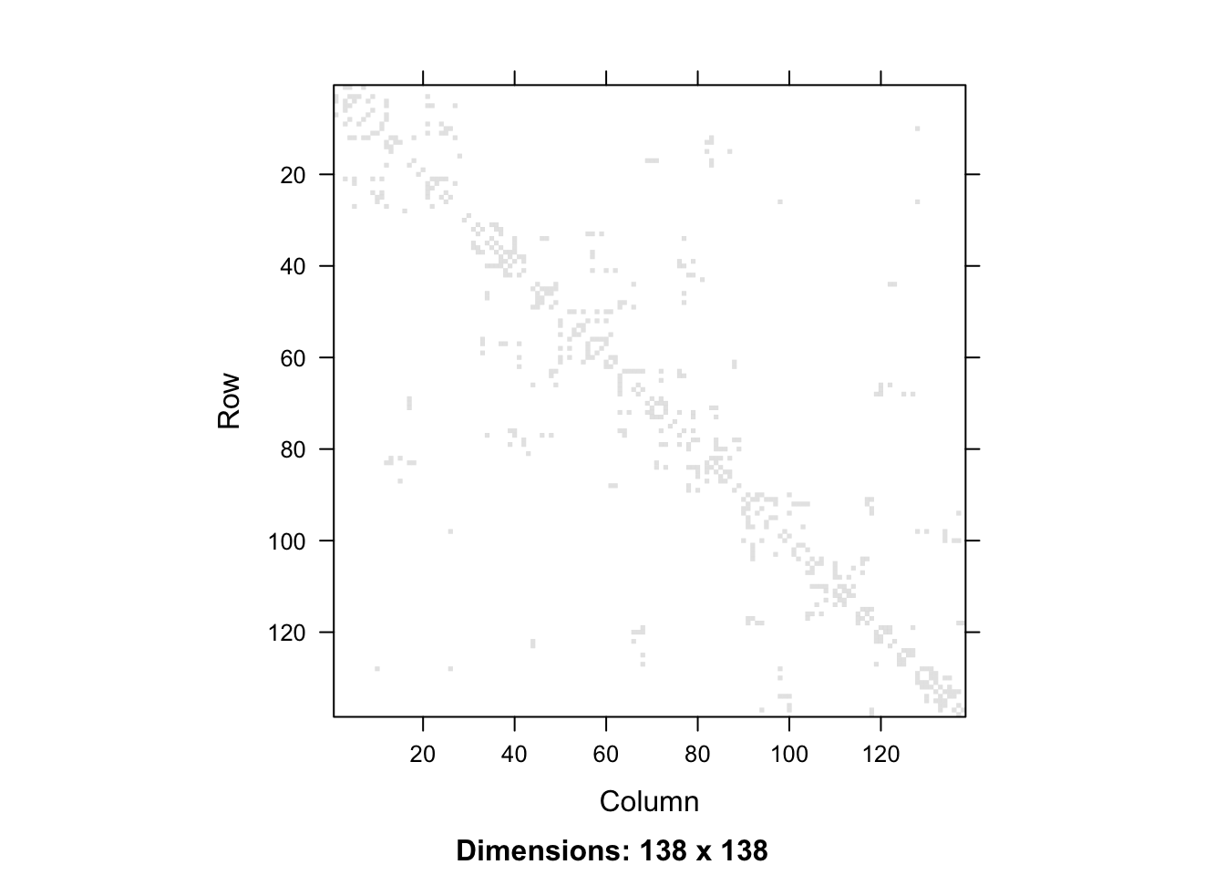
Or if we want a ggplot2 version, we would convert from a matrix to a data frame. This data frame has 138 rows and columns and is symmetric, so we add a column that denotes which row of the matrix each row of the data frame represents, and then pivot from wide to long format, so that we can plot that for this row and column in the adjacency matrix, the value is given by a 0 or a 1. We need to ensure that the row and column variables are both integers, as if they were character labels, the string 1 is followed by the string 11, then 12, rather than \(1,2,3\) as we know they should follow.
as.data.frame(adm2_nb) %>%
    tibble::rowid_to_column(var = "row") %>%
  pivot_longer(cols = -row, names_to = "column", values_to = "value") %>%
  mutate(value = value + 0) %>%
  mutate_at(.vars = vars(column, row, value),
            .funs = function(x){parse_number(as.character(x))}) %>%
  ggplot(data = ., aes(x = column, y=row)) +
  geom_raster(aes(fill = factor(value))) +
  coord_equal() +
  scale_y_reverse() +
  theme_bw() +
  scale_fill_manual(values = c("0" = "white", "1" = "black")) +
  theme(legend.position = "none", panel.grid = element_blank())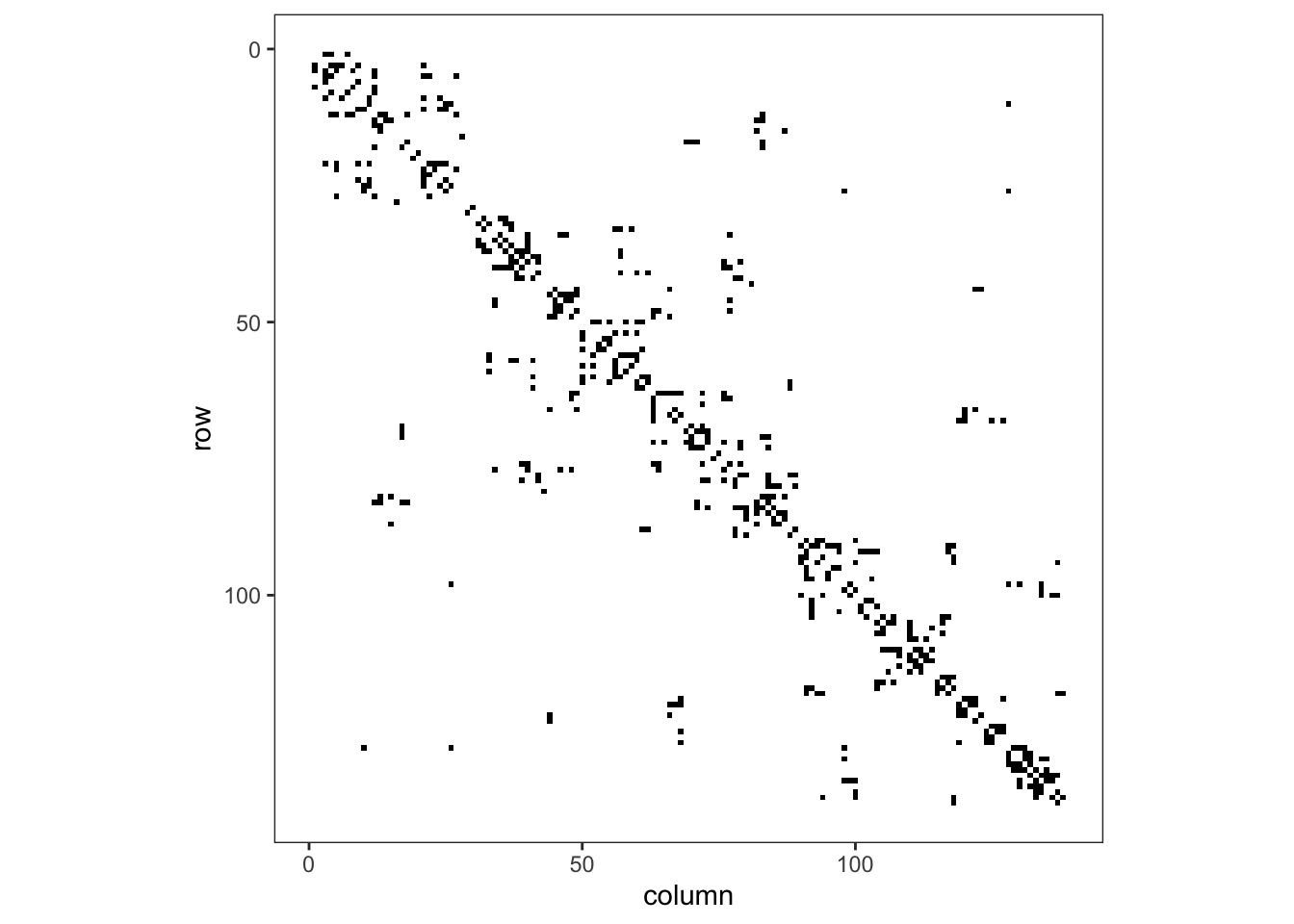
Figure 1: Adjacency matrix for adm2
Exercise 2
The variable dtp3coverage2016 is the vaccine coverage proportion,
\[ p_{i}= \frac{Y_{i}}{m_{i}}:i=1,\ldots,n \]
- Create a plot showing the vaccine coverage for each area.
- Without performing a formal test, does it appear that there is a spatial effect at play here?
We can use either the mapview package or use ggplot2’s ability to plot simple features to show the vaccine coverage.
library(mapview)
mapview(adm2, zcol = "dtp3coverage2016")
ggplot() + geom_sf(data = adm2, aes(fill = dtp3coverage2016)) +
scale_fill_viridis_c() +
theme_bw()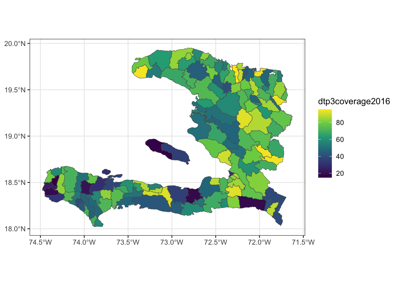
We can see that regions with high coverage tend to be near other regions of high coverage, but at this point we are unsure if this spatial variability is due to a predictor variable we have measured or due to some spatial process that we can’t directly model.
Exercise 3
Conduct an exploratory analysis to look at the relationship between DTP3 coverage in 2016 and the percentage of residents living in urban settings using the empirical logit transform of the proportion data.
Create a variable
elogitpwhich is the empirical logit of the vaccine coverage using the formula
\[ \tilde{p_{i}}=\log\left(\frac{Y_{i}+1/2}{m_{i}-Y_{i}+1/2}\right):i=1,\ldots,n \]Create a visualisation to compare the empirical logit vaccine coverage to the proportion of people living in urban environments in each administrative region.
If we wish to explain the variability in vaccine coverage, does it appear that there’s an association with urban living?
adm2 <- mutate(adm2,
               p = vacc_num/vacc_denom,
               elogitp = log(
                 (vacc_num + 1/2) /              # successes + 1/2n
                   (vacc_denom - vacc_num + 1/2) # failures + 1/2n
               ) # end log
) # end mutate

# Compare to the percentage of urban
ggplot(adm2, aes(x = urbanpct, y = elogitp)) +
  geom_point() +
  geom_smooth() +
  theme_bw()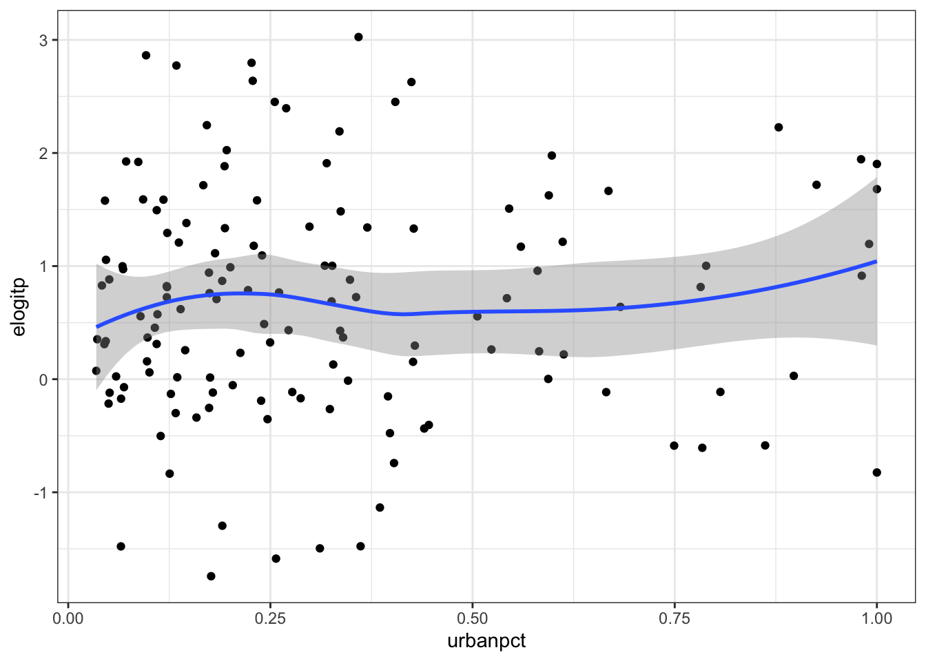
Fit intercept logistic model
Exercise 4
- Fit a GLM with just an intercept. This will give us an idea of the average vaccine coverage across the study area.
We can look at the summary of the fitted model to get a table of coefficient estimates (on the logit scale) and the AIC.
mod_base <- glm(p ~ 1, data = adm2,
                family = "binomial",
                weights = vacc_denom)

summary(mod_base)
##
## Call:
## glm(formula = p ~ 1, family = "binomial", data = adm2, weights = vacc_denom)
##
## Coefficients:
## Estimate Std. Error z value Pr(>|z|)
## (Intercept) 0.709750 0.003804 186.6 <2e-16 ***
## ---
## Signif. codes: 0 '***' 0.001 '**' 0.01 '*' 0.05 '.' 0.1 ' ' 1
##
## (Dispersion parameter for binomial family taken to be 1)
##
## Null deviance: 48588 on 137 degrees of freedom
## Residual deviance: 48588 on 137 degrees of freedom
## AIC: 49609
##
## Number of Fisher Scoring iterations: 4Alternatively, the glance function from the broom package can give us some quick model summaries as a data frame.
library(broom)
glance(mod_base)
## # A tibble: 1 × 8
## null.deviance df.null logLik AIC BIC deviance df.residual nobs
## <dbl> <int> <dbl> <dbl> <dbl> <dbl> <int> <int>
## 1 48588. 137 -24803. 49609. 49612. 48588. 137 138- Take the inverse logit of the estimate of the intercept and its 95% confidence interval. What is the average vaccine coverage in the study region?
library(boot) # for the inv.logit() function
bind_cols(data.frame(estimate = coef(mod_base)),
      t(confint(mod_base))) %>%
  mutate_all(.funs = inv.logit)
## estimate 2.5 % 97.5 %
## (Intercept) 0.6703458 0.6686967 0.6719922Exercise 5
- Fit a logistic regression model with
urbanpctas a predictor variable. - What unit is
urbanpctmeasured in? - Calculate the Odds ratio of
urbanpctand its 95% confidence interval for each unit increase - Use a calculation within the function
I()(which inhibits the conversion of objects) so thaturbanpctis in units of 10%. - Refit the model and calculate the Odds ratio.
The urbanpct is measured as a proportion between 0 and 1, representing the effect of moving everyone in a region from living in a rural area to everyone living in an urban area in that same region.
mod_urbanpct <- glm(p ~ 1 + urbanpct,
                    data = adm2,
                    family = "binomial",
                    weights = vacc_denom)

tidy(mod_urbanpct, conf.int = TRUE) %>%
  dplyr::filter(term != "(Intercept)") %>%
  dplyr::select(term, estimate, conf.low, conf.high) %>%
  dplyr::mutate(estimate = exp(estimate),
                conf.low = exp(conf.low),
                conf.high = exp(conf.high))
## # A tibble: 1 × 4
## term estimate conf.low conf.high
## <chr> <dbl> <dbl> <dbl>
## 1 urbanpct 1.97 1.92 2.01# re-scaled
glm(p ~ 1 + I(urbanpct*10), # convert to effect of 10% increases instead of 100% increase
data = adm2,
family = "binomial",
weights = vacc_denom) %>%
tidy(., conf.int = TRUE) %>%
dplyr::filter(term != "(Intercept)") %>%
dplyr::mutate(estimate = exp(estimate),
conf.low = exp(conf.low),
conf.high = exp(conf.high))## # A tibble: 1 × 7
## term estimate std.error statistic p.value conf.low conf.high
## <chr> <dbl> <dbl> <dbl> <dbl> <dbl> <dbl>
## 1 I(urbanpct * 10) 1.07 0.00111 60.7 0 1.07 1.07NB: Regarding the Odds Ratios, \(1.07^{10} \approx 1.97\)
Exercise 6
- Extract the residuals from the
urbanpctmodel - Add the residuals to the
data.frameperhaps calledurban_res - Map the
urban_resresiduals. - After fitting the model with one spatially varying variable, does it appear that there is any leftover spatial variability in the model?
adm2_urbanpct_aug <- bind_cols(adm2, augment(mod_urbanpct)) %>%
  rename(urban_res=.resid)

ggplot() + geom_sf(data = adm2_urbanpct_aug,
                   aes(fill = urban_res)) +
  scale_fill_gradient2() +
  theme_bw()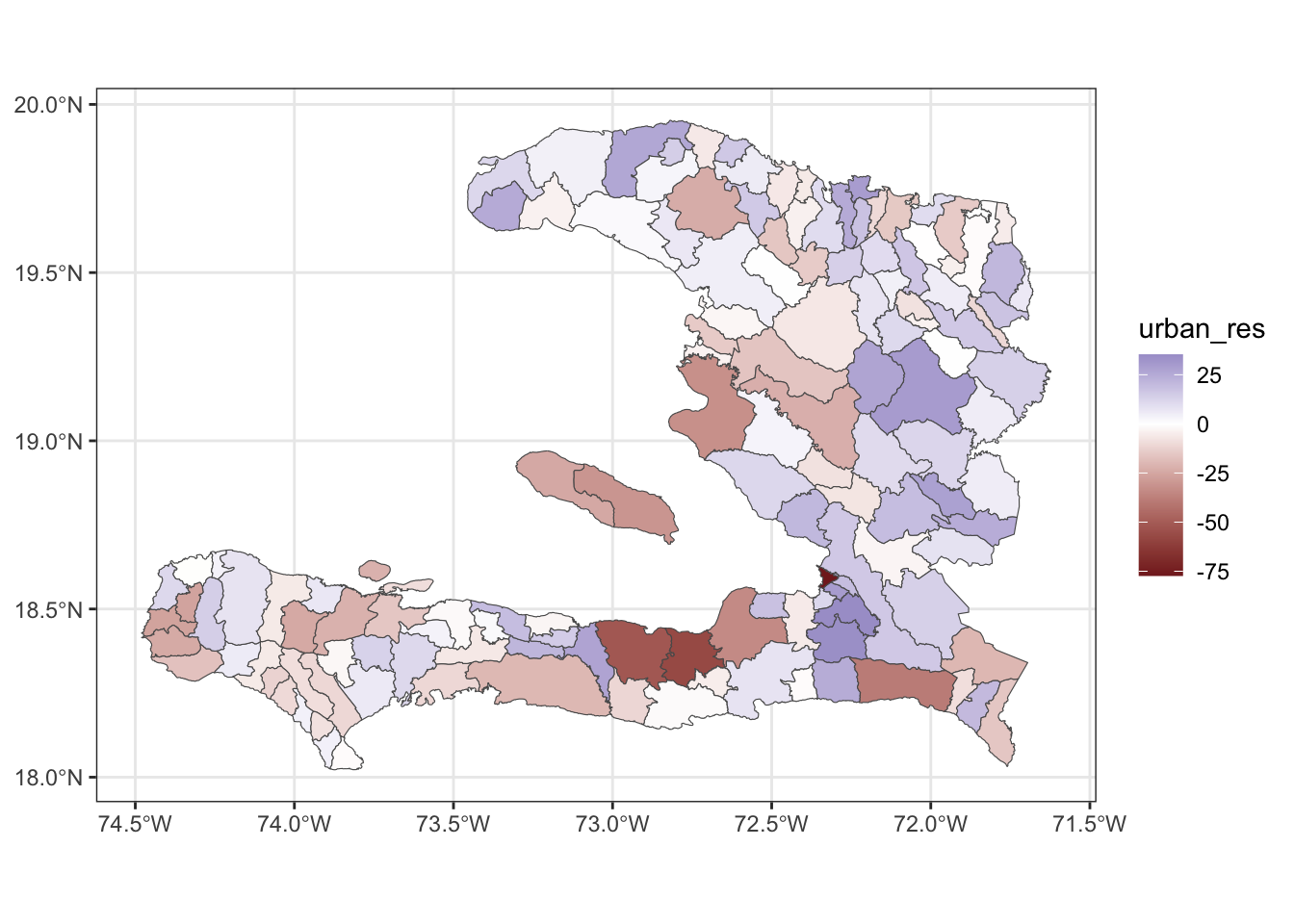
We see that the eastern regions tend to have a bluer colour, indicating that these have a higher residual value, indicating that the model underpredicts in these regions.
Areal spatial regression models
Exercise 7
- Extract the fitted values and add them to the data frame containing the adm2 data
- Reshape the data frame to prepare for visualisation of the observed values as well as the predictions from the models with and without the MRF smooth.
- Make a visualisation with small multiples that shows the fitted values and observed values
Fitting the model it isn’t necessary to pass in the list of matrices representing the polygons, as we will generally do our plotting by combining model output with the adm2 simple feature rather than directly plotting the model object.
library(mgcv)
adm2 <- mutate(adm2,
               adm1code = factor(adm1code))

iid_urbanpct <- gam(p ~ 1 + urbanpct +
                      s(adm1code, bs="re"),
                    data = adm2,
                    family = "binomial",
                    weights = vacc_denom)

adm2 <- mutate(adm2,
               adm2code = factor(adm2code),
               REGION_ID = levels(adm2code))


nb_adm2 <- adm2 %>%
    st_transform(crs = "+proj=utm +zone=18 ellps=WGS84") %>%
    st_queen(sparse=FALSE)

W_adm2 <- diag(rowSums(nb_adm2)) -nb_adm2

adm2_polygons <- st_coordinates(adm2) %>%
  as.data.frame %>%
  select(X, Y, L3) %>%
  split(.$L3) %>%
  map(~as.matrix(.x[,c(1,2)]))

names(adm2_polygons) <- adm2$adm2code

mrf_urbanpct <- gam(p ~ 1 + urbanpct +
                      s(adm2code,
                        bs="mrf", k = 100,
                        xt = list(penalty = nb_adm2,
                                  polys = adm2_polygons)),
                    data = adm2,
                    family = "binomial",
                    weights = vacc_denom)
Now we gather on the observed p and fitted .fitted columns so we can plot with small multiples,
adm2_fitted <-
  adm2 %>%
  mutate(GLM = fitted(mod_urbanpct, type = "response"),
         IID = fitted(iid_urbanpct, type = "response"),
         MRF = fitted(mrf_urbanpct, type = "response"))

adm2_fitted %>%
  rename(Observed = p) %>%
  pivot_longer(cols = c(Observed, GLM, IID, MRF), names_to = "key", values_to = "value") %>%
  ggplot(data = .) +
  geom_sf(aes(fill = value)) +
  facet_wrap(~key) +
  scale_fill_viridis_c(limits = c(0,1)) + theme_bw()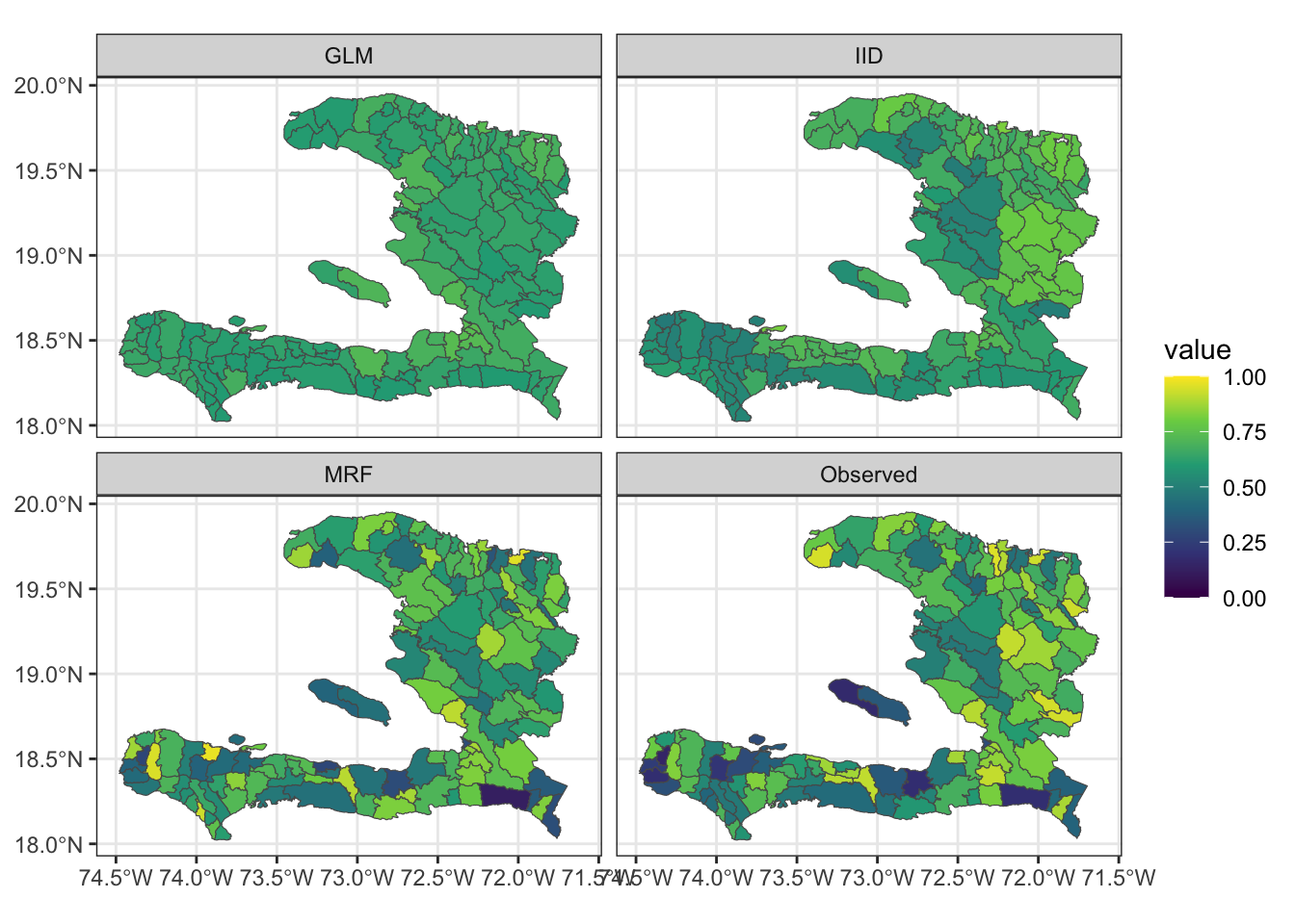
Exercise 8
- Extract the residuals from the fitted model objects
- Reshape the data frame appropriately
- Create a spatial visualisation for the residuals from each model
- Create a scatterplot showing how the fitted values (on the link scale) vary with the empirical logit, to show how close the predictions are to the data
adm2_residuals <-
  adm2 %>%
  mutate(GLM = residuals(mod_urbanpct, type = "pearson"),
         IID = residuals(iid_urbanpct, type = "pearson"),
         MRF = residuals(mrf_urbanpct, type = "pearson"))

adm2_residuals %>%
  pivot_longer(cols = c(GLM, IID, MRF), names_to = "key", values_to = "value") %>%
  ggplot(data = .) +
  geom_sf(aes(fill = value)) +
  facet_wrap(~key) +
  scale_fill_gradient2() + theme_bw() +
  theme(legend.position = "bottom")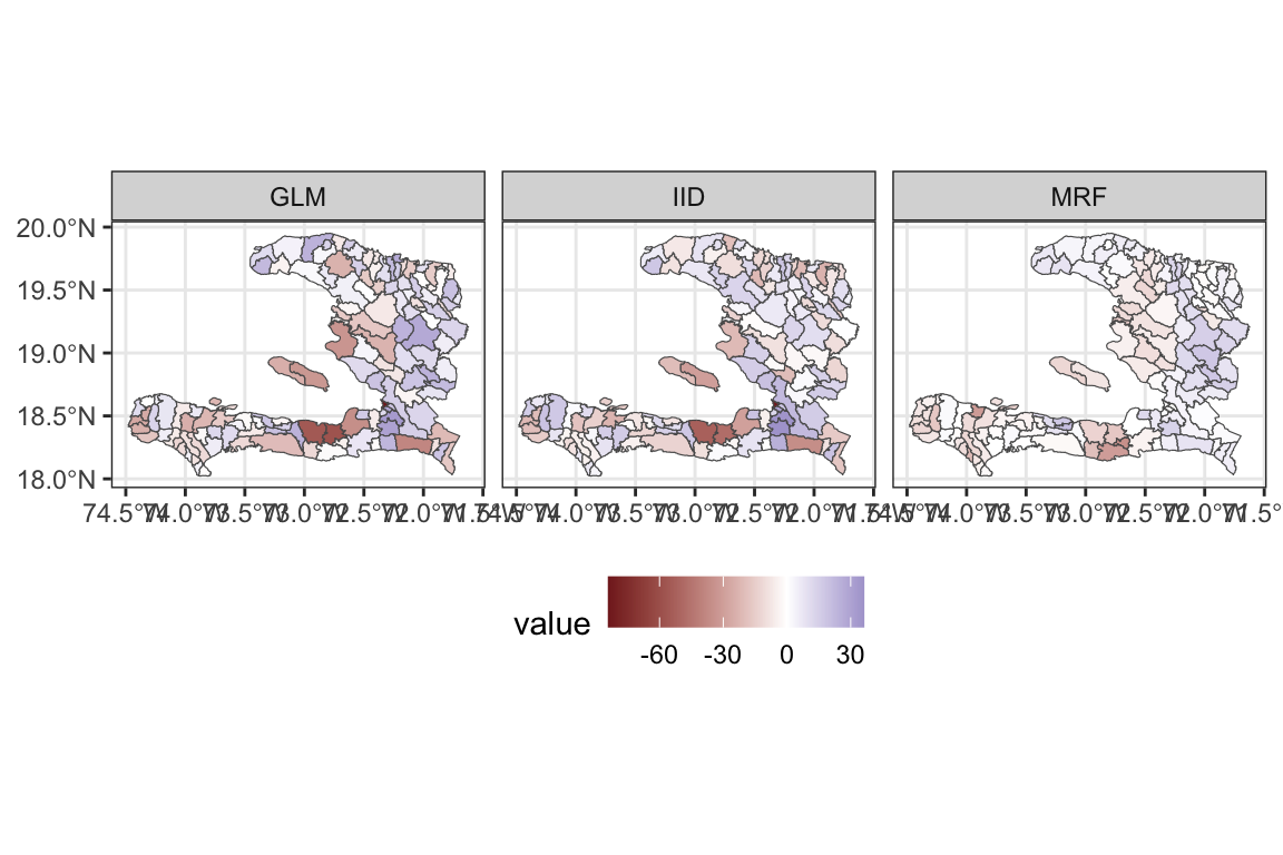
And for the scatterplot with the empirical logit
adm2_fitted %>%
  pivot_longer(cols = c(GLM, IID, MRF), names_to = "key", values_to = "value") %>%
  ggplot(data = .) +
  geom_point(aes(x = elogitp, y = logit(value))) +
  facet_wrap(~key) +
  geom_abline(intercept = 0, slope = 1) +
  theme_bw() +
  coord_equal() +
  ylab("logit(fitted value)") + xlab("Empirical logit of observed coverage")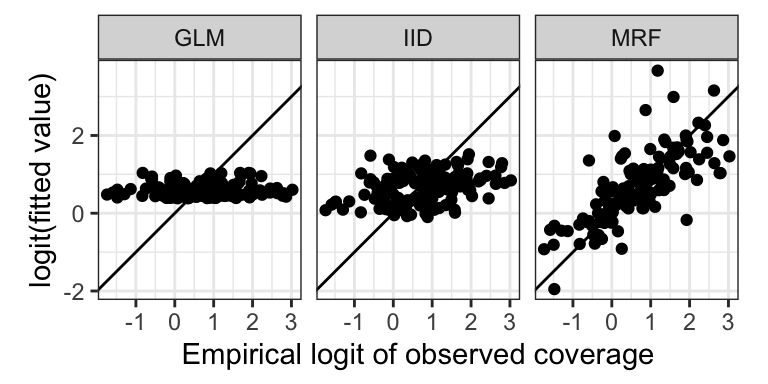
Exercise 9
Calculate the spatial correlation of the residuals from these two models
Calculate the standard deviation of the residuals to show how much leftover variation there is.
library(spdep)
adm2_listw <- mat2listw(adm2_nb, style = "B", zero.policy = TRUE)

calculate_moran <- function(x){
  moran(x = x,# what is correlated?
        listw = adm2_listw, # how are the regions connected?
        n = nrow(adm2_nb),  # how many regions?
        S0 = sum(adm2_nb),  # how many connections are there?
        zero.policy = TRUE)$I
}

adm2_residuals %>%
  as.data.frame %>%
  summarise(GLM = calculate_moran(GLM),
            IID = calculate_moran(IID),
            MRF = calculate_moran(MRF))
## GLM IID MRF
## 1 0.1207994 0.02177376 0.6328509adm2_residuals %>%
as.data.frame %>%
summarise(GLM = sd(GLM),
IID = sd(IID),
MRF = sd(MRF))## GLM IID MRF
## 1 17.99376 16.60707 9.388051glance(mod_urbanpct)## # A tibble: 1 × 8
## null.deviance df.null logLik AIC BIC deviance df.residual nobs
## <dbl> <int> <dbl> <dbl> <dbl> <dbl> <int> <int>
## 1 48588. 137 -22935. 45875. 45881. 44852. 136 138glance(iid_urbanpct)## # A tibble: 1 × 7
## df logLik AIC BIC deviance df.residual nobs
## <dbl> <dbl> <dbl> <dbl> <dbl> <dbl> <int>
## 1 11.0 -19446. 38913. 38945. 37873. 127. 138glance(mrf_urbanpct)## # A tibble: 1 × 7
## df logLik AIC BIC deviance df.residual nobs
## <dbl> <dbl> <dbl> <dbl> <dbl> <dbl> <int>
## 1 101. -5999. 12199. 12495. 10979. 37.0 138- Which of these models best accounts for the spatial variability in the data and why?
The Markov Random Field model is best. While the spatial correlation of the residuals is higher, their standard deviation is much lower; indicating that more of the spatial variability has been accounted for. This is confirmed by the AIC of the MRF model being 12199 which is much lower than the values of 45875 and 38913 for the non-spatial GLM and the model with an IID spatial random effect at the adm1 level respectively.
Extension exercises
Exercise 10
Modify the code above to conduct the analysis for an MRF spatial effect for the administrative regions in the adm1code variable and compare the effect of urbanicity, residuals and AIC to the model with the MRF for the adm2code variable.
First, we need to aggregate the level 2 admin regions to their level 1 counterparts
adm1 <- aggregate(x = adm2, by = list(adm2$adm1_en), FUN = length)The FUN argument here is a bit arbitrary, as we just want the geometry. Here we’ve chosen length because it doesn’t matter what type of variable is being aggregated.
We can then calculate the spatial adjacency
W1 <- st_queen(adm1, sparse = F)
W1_mat <- as.matrix(W1) + 0L
W1_listw <- mat2listw(W1_mat, style = "B", zero.policy = TRUE)
W1## [,1] [,2] [,3] [,4] [,5] [,6] [,7] [,8] [,9] [,10]
## [1,] FALSE TRUE FALSE FALSE TRUE FALSE TRUE FALSE FALSE TRUE
## [2,] TRUE FALSE FALSE FALSE FALSE FALSE FALSE FALSE FALSE TRUE
## [3,] FALSE FALSE FALSE TRUE FALSE FALSE FALSE TRUE FALSE FALSE
## [4,] FALSE FALSE TRUE FALSE FALSE FALSE FALSE TRUE TRUE TRUE
## [5,] TRUE FALSE FALSE FALSE FALSE FALSE TRUE FALSE FALSE FALSE
## [6,] FALSE FALSE FALSE FALSE FALSE FALSE FALSE FALSE FALSE FALSE
## [7,] TRUE FALSE FALSE FALSE TRUE FALSE FALSE FALSE FALSE FALSE
## [8,] FALSE FALSE TRUE TRUE FALSE FALSE FALSE FALSE TRUE FALSE
## [9,] FALSE FALSE FALSE TRUE FALSE FALSE FALSE TRUE FALSE FALSE
## [10,] TRUE TRUE FALSE TRUE FALSE FALSE FALSE FALSE FALSE FALSEOr turn the level 1 geometry into a list of matrices representing the polygons and have R work it out for us in the model fitting.
nb_adm1 <- adm1 %>%
split(.$Group.1) %>%
map(~st_coordinates(.x)) %>%
map(~matrix(.x[,1:2], ncol = 2, byrow=F))We now fit our model,
gam_adm1 <- gam(data = adm2,
p ~ 1 + urbanpct +
s(factor(adm1_en),
bs = 'mrf',
xt = list(polys = nb_adm1)),
family = 'binomial',
weights = vacc_denom)Having fit the model we can now visualise the predictions alongside the data
# here we use as.numeric because predict() wants to return an array
adm2 %<>% mutate(ADM1 = as.numeric(predict(gam_adm1, ., type = 'response')))
adm2 %<>% mutate(ADM2 = as.numeric(predict(mrf_urbanpct, ., type = 'response')))
adm2 %>% select(geometry, data = p, ADM1, ADM2) %>%
gather(key, value, -geometry) %>%
ggplot(data = .) +
geom_sf(aes(fill = value),
size = 0.5,
color = 'grey40') +
facet_grid(. ~ key) +
theme_minimal() +
scale_fill_viridis_c()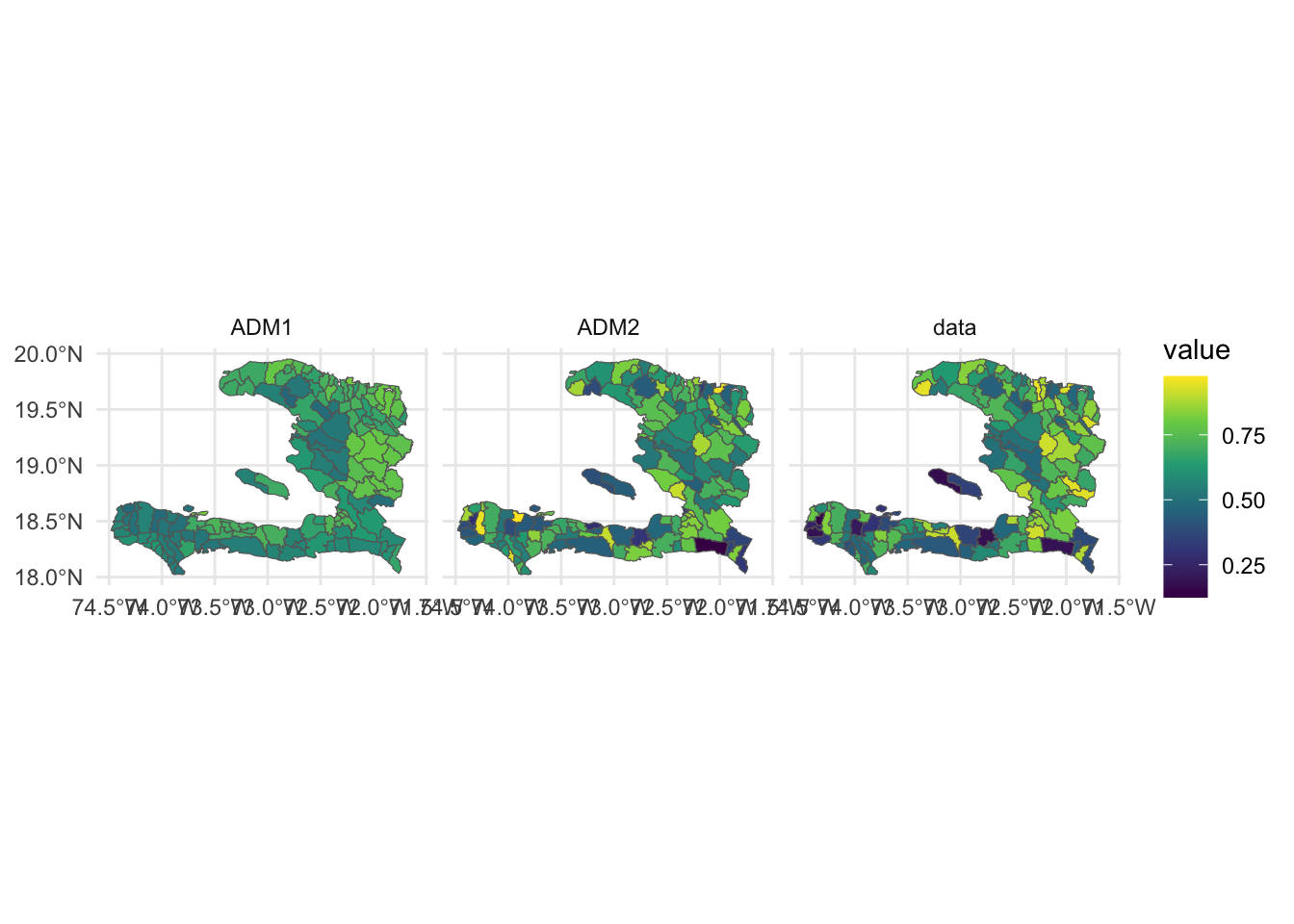
We also want to look at the AIC
models <- list(ADM1 = gam_adm1,
ADM2 = mrf_urbanpct)
lapply(models, glance)## $ADM1
## # A tibble: 1 × 7
##      df  logLik    AIC    BIC deviance df.residual  nobs
##   <dbl>   <dbl>  <dbl>  <dbl>    <dbl>       <dbl> <int>
## 1  11.0 -19446. 38913. 38945.   37873.        127.   138
##
## $ADM2
## # A tibble: 1 × 7
##      df logLik    AIC    BIC deviance df.residual  nobs
##   <dbl>  <dbl>  <dbl>  <dbl>    <dbl>       <dbl> <int>
## 1 101. -5999. 12199. 12495. 10979. 37.0 138and see that the level 2 admin level model far outperforms the level 1 admin model, which makes sense given the level 1 model has 10 terms in its spatial effect (one for each department) vs the 100 found in the level 2 model (low rank approximation to the 138 arrondissements).
We have been warned about a region with no neighbours, so Moran’s \(I\) won’t work here just yet. But we can at least look at the standard deviation of the residuals
models %>%
    lapply("residuals") %>%
    lapply(sd)
## $ADM1
## [1] 16.6261
##
## $ADM2
## [1] 8.949951and visualise them
models %>%
    lapply("residuals") %>%
    lapply(function(x){mutate(adm2, .resid = x)}) %>%
    bind_rows(.id = "Model") %>%
    ggplot(data = .) +
    geom_sf(aes(fill = .resid)) +
    facet_grid(. ~ Model) +
    scale_fill_gradient2(midpoint = 0)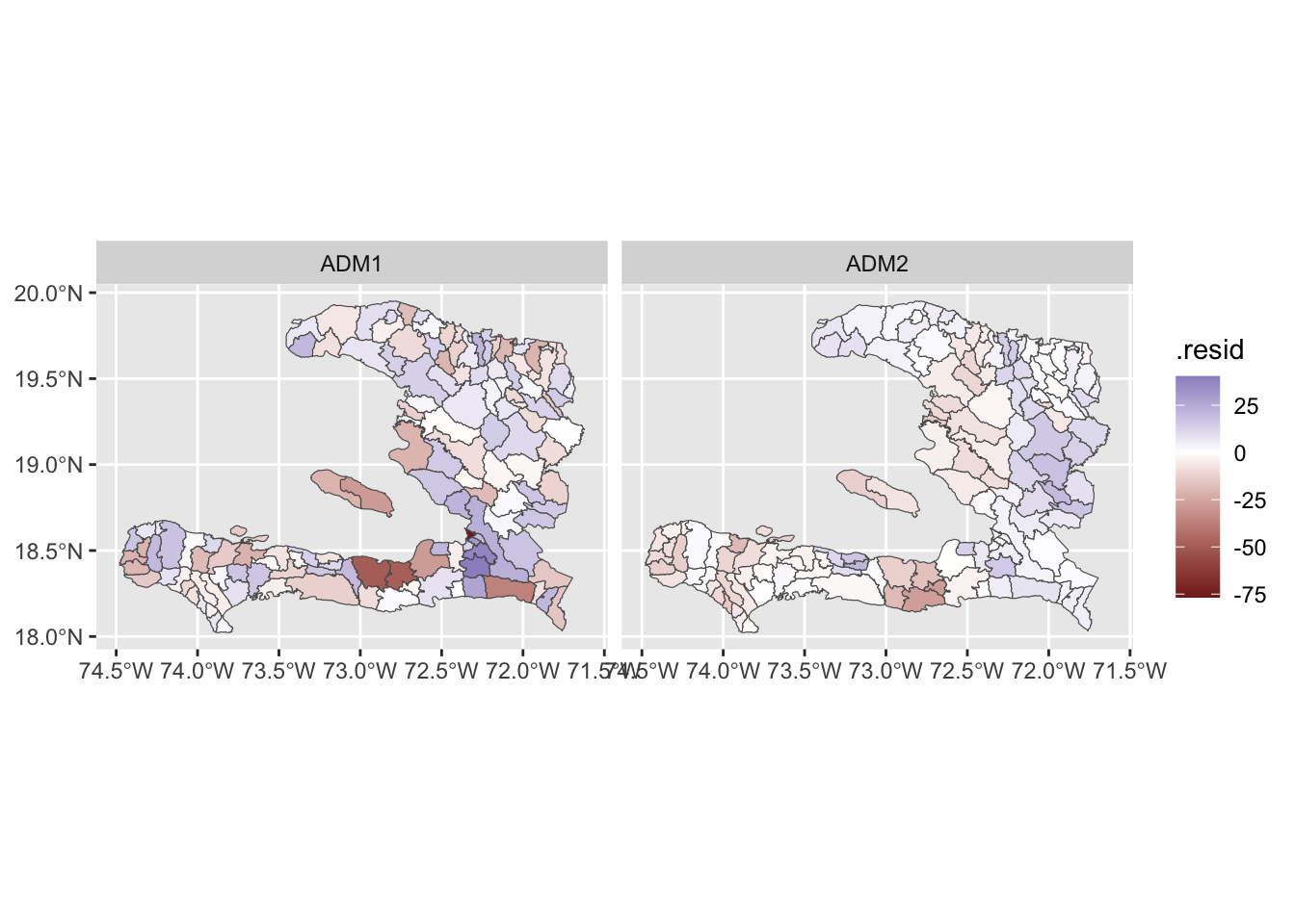
We see that the level 2 model has residuals which are smaller in magnitude even if they likely have higher spatial autocorrelation. The residuals for the level 1 model have less spatial autocorrelation because we have fit a (spatially smoothed) mean for each department.
Exercise 11
- Investigate which of the regions in the
adm2data set have zero neighbours or do not appear to be connected to their neighbours properly and determine an appropriate set of neighbours for them - Modify the weights matrix to include these neighbours
- Refit the models and assess the goodness of fit and correlation of the residuals
W <- st_queen(adm2)
W_mat <- as.matrix(W) + 0
W_mat <- W_mat - diag(diag(W_mat)) # subtract the diagonals, so W[i,i] = 0
W_empties <- which(rowSums(W_mat) == 0)
adm2 %<>% mutate(RECORD_ID = 1:nrow(.))
haiti_no_empties <- adm2[-c(W_empties), ]
haiti_empties <- adm2[c(W_empties), ]
# find each region's nearest neighbour
W_nn <- haiti_no_empties[
st_nearest_feature(haiti_empties,
haiti_no_empties), "RECORD_ID"] %>%
pull(RECORD_ID)
for (i in 1:length(W_empties)){
W_mat[W_nn[i], W_empties[i]] <- 1
W_mat[W_empties[i], W_nn[i]] <- 1
}
W_listw <- mat2listw(W_mat, style = "B")
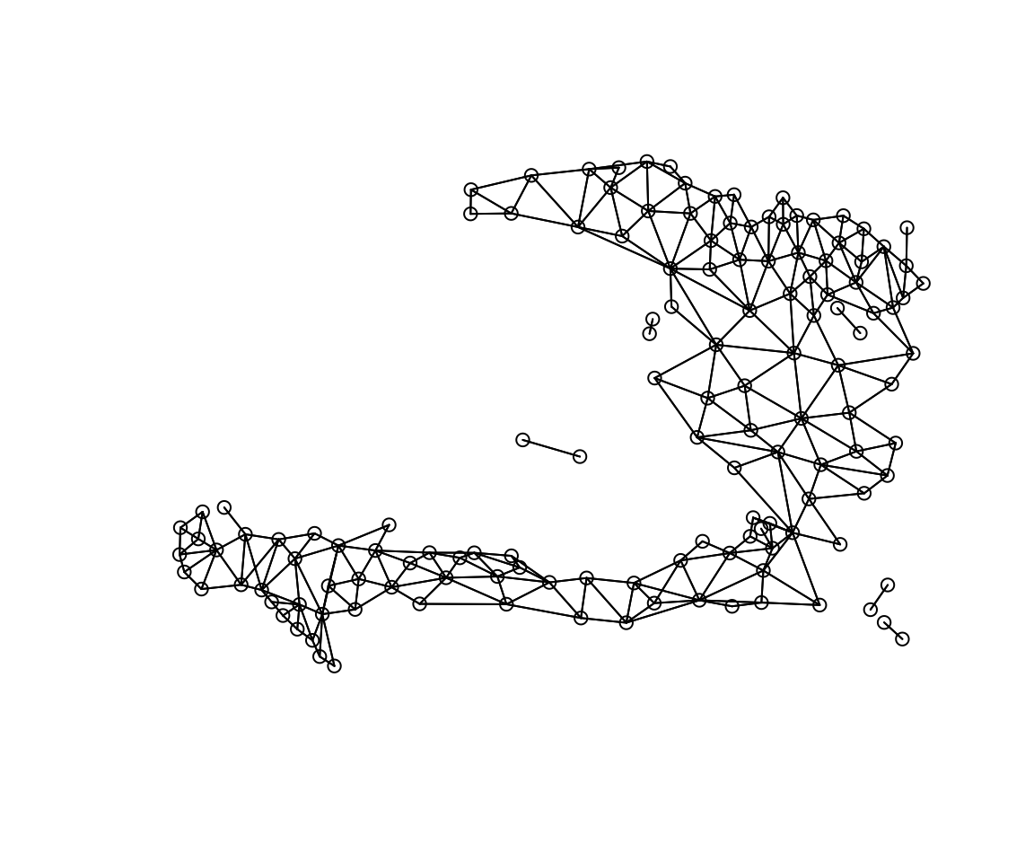
coords <- st_centroid(adm2) %>% st_coordinates
plot(W_listw, coords)