Objectives
In this session we will show how to perform a spatial analysis of areal data, considering the regions as group for random effects in a Generalised Linear Mixed Model. We will investigate the presence of spatial autocorrelation in data using Moran’s \(I\), and consider how to adjust for spatial correlation using a variety of approaches for neighbourhood structure.
The session will cover:
- Calculating spatial weights matrices using simple feature operations
- Test residuals and variables for spatial correlation using Moran’s \(I\)
- Adjusting for spatial structure using the mgcv package.
A good text on learning the ins and outs of Generalised Linear Models is Dobson and Barnett (2008); for Generalised Additive models, Wood (2017); and for more general multilevel/hierarchical modelling, Gelman and Hill (2006). For coming to terms with spatial and spatio-temporal modelling, Wikle, Zammit-Mangion, and Cressie (2019) is an updated version of Noel Cressie’s classic text from the 1990s (Cressie 1993).
Packages
# Load the packages needed for this practical
if (!require("pacman")) install.packages("pacman")
pkgs = c("sf", "mgcv",
         "tidyverse")
pacman::p_load(pkgs, character.only = T)
What is Areal data
Areal data is discrete spatial data which relates to aggregated units. For example, the number of crimes in each state, or the prevalence of a disease in an administrative area. Although the measurement may exist at a more granular level, such as the locations of the crimes, often the data is only collected or presented at the aggregated level. Due to the aggregation into polygons, methods which assume that the observations are located at points are not appropriate. Areal data is often visualised using choropleth maps.
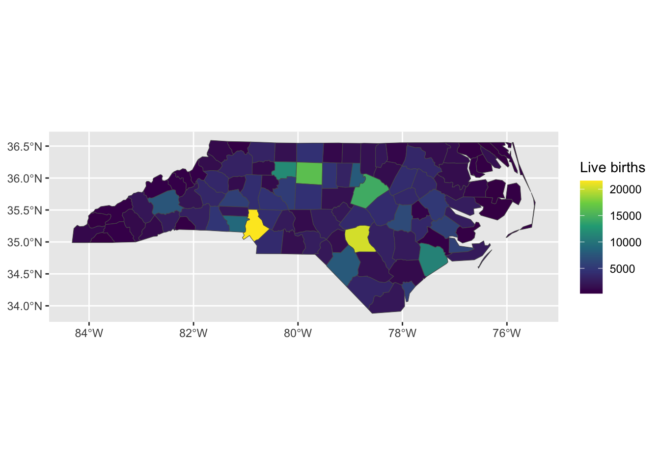
Figure 1: Number of live births in 1974 the counties of North Carolina, USA
Measuring connectivity
In order to model variation across spatial regions we need a way to define which regions are related, i.e. a measure of connectivity.
Distances between centroids
There are two main ways that spatial connectivity is measured with areal data. One approach is to take the centroid of the areas and then measure the distances between the centroid points. Typically, a distance measure is used that assumes that objects that are further away are less related than objets that are closer together. A downside to this approach, especially when the units have irregular shapes, is that the centroids may not be a good representation of the locations of the area. A further downside is that the distances between the points may not actually represent spatial connectivity.
Adjacency of polygons
An alternative way to measure connectivity is to use adjacency. For this metric area that share common boundaries or vertices might be considered connected, sometimes called neighbours. There are two main ways of defining neighbours: Queen case and Rook case. Queen case include vertices and boundaries, whereas Rook case only includes boundaries. Neighbours can also be measured using the distance between centroids metric, either by using k-nearest-neighbours or using a buffer around each point to define the neighbours. Here we will focus on polygon connectivity. We define two functions that tell us whether polygons in the simple feature share an edge (rook) or at least one point (queen).
This is done by using regular expressions to poll the listed relationships between polygons in the simple feature,
st_queen <- function(a, b = a,...) st_relate(a, b, pattern = "F***T****", ...)
st_rook  <- function(a, b = a,...) st_relate(a, b, pattern = "F***1****", ...)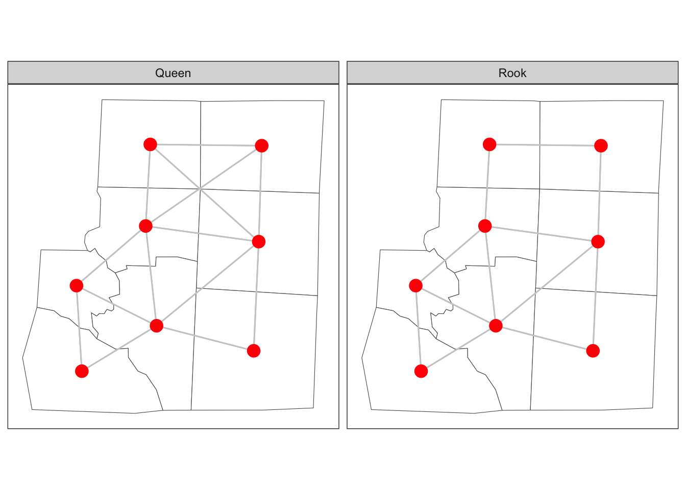
Figure 2: Adjacency of six counties in North Carolina
Spatial weights matrix
In order to include the spatial connectivity in our analyses we need a way to represent it mathematically. This is usually done using a matrix, often termed a spatial weights matrix. For the distance case, each element in the matrix will represent some function of the distance between the centroids. For adjacency, the spatial weight matrix could have a value of 1 for neighbours and a value of zero when units aren’t neighbours.
Case study - Haiti vaccine coverage
| Variable | Description |
|---|---|
| adm2code | Admin 2 level code |
| adm1code | Admin 1 level code |
| adm1_en | Admin 1 name English |
| adm2_en | Admin 2 name English |
| adm0code | Admin 0 level code |
| adm0_en | Admin 0 name English |
| female | Number of females 2013 |
| male | Number of males 2013 |
| under_18 | Number of under 18s 2013 |
| age_18_and_over | Number of over 18s 2013 |
| rural | Rural population 2013 |
| urban | Urban population 2013 |
| total | Total population 2013 |
| dtp3coverage2016 | Vaccine coverage 2016 (%) |
| vacc_num | Number vaccinated 2016 |
| vacc_denom | Number eligible for vaccination 2016 |
| urbanpct | Proportion of population living in urban area 2013 |
| geometry | The polygon for admin 2 |
The functions in sf allow us to define neighbourhood structures and convert these to spatial weights matrices in R. The spatial weights matrix will be used later for regression modelling and assessing spatial correlation.
library(sf)
sf_use_s2(FALSE)
adm2 <- st_read('data/haiti/adm2.geojson',
stringsAsFactors = F, quiet = TRUE)
# create a neighbours object
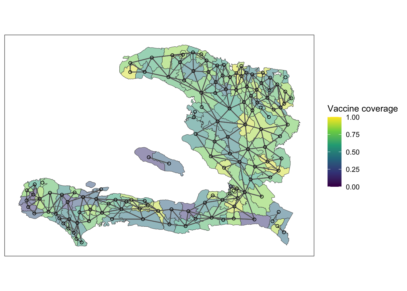
adm2_nb <- st_queen(adm2, sparse=FALSE)The structure of the weights matrix, \(W\), tells us which of the nodes in our graph (the regions) are neighbours of each other, and these are shown above with edges connecting the centroids of the regions. If two nodes, \(i\) and \(j\), in the graph are connected by an edge, then \(w_{ij} = w_{ji} = 1\). If they are not connected by an edge, then \(w_{ij} = w_{ji} = 0\). The rows and columns are numbered according to the index of the region code in the adm2sp data.
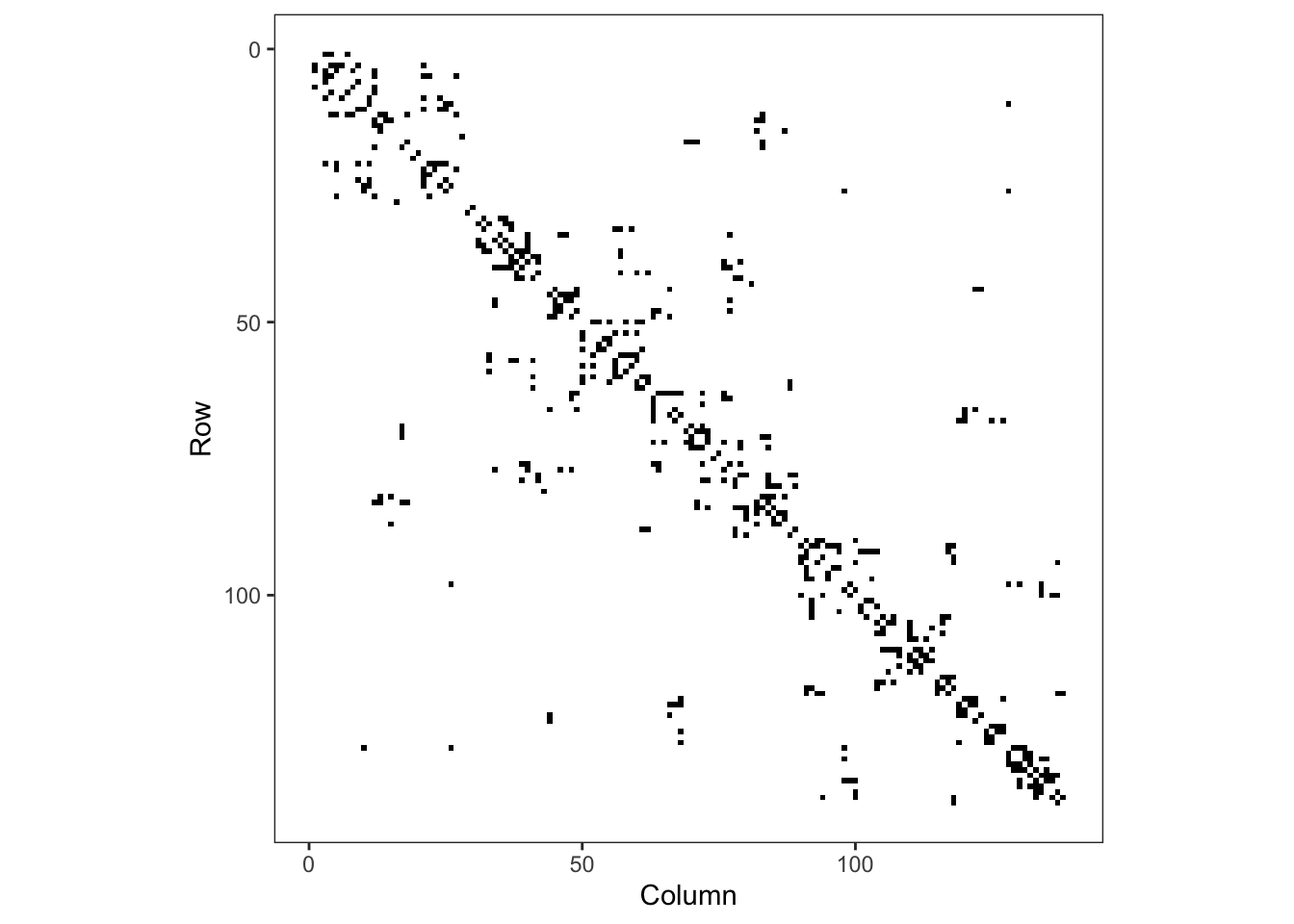
Figure 3: Adjacency matrix for adm2
Plotting the mesh defined by the adjacency matrix on top of the polygons of the adm2 data frame we see the relationship between adjacent polygons.
Exploratory analysis
Exercise 1
- Load the
adm2.geojsonfile and use thestringsAsFactors = Foption - Create a spatial weights matrix using
st_queen() - Look at the structure of the spatial weights matrix either by printing or Viewing it. Hint: you can add 0 to the matrix to convert from logical to numeric entries
Exercise 2
The variable dtp3coverage2016 is the vaccine coverage proportion,
\[ p_{i}= \frac{Y_{i}}{m_{i}}:i=1,\ldots,n \]
- Create a plot showing the vaccine coverage for each area.
- Without performing a formal test, does it appear that there is a spatial effect at play here?
Exercise 3
It may be that any spatial pattern in the observed data is attributable to measured variables that also vary in space. Conduct an exploratory analysis to look at the relationship between DTP3 coverage in 2016 and the percentage of residents living in urban settings. Here we will use the empirical logit of the vaccine coverage so that our \(y\) value on any plots isn’t restricted to the range \((0,1)\)
- Create a variable
elogitpwhich is the empirical logit of the vaccine coverage using the formula
\[ \tilde{p_{i}}=\log\left(\frac{Y_{i}+1/2}{m_{i}-Y_{i}+1/2}\right):i=1,\ldots,n \] - Create a visualisation to compare the empirical logit vaccine coverage to the proportion of people living in urban environments in each administrative region.
- If we wish to explain the variability in vaccine coverage, does it appear that there’s an association with urban living?
summarise(adm2, n())## Simple feature collection with 1 feature and 1 field
## Geometry type: MULTIPOLYGON
## Dimension: XY
## Bounding box: xmin: -74.4804 ymin: 18.02214 xmax: -71.62215 ymax: 19.95268
## Geodetic CRS: WGS 84
## n() geometry
## 1 138 MULTIPOLYGON (((-73.83383 1...adm2 <- mutate(adm2,
p = vacc_num/vacc_denom,
elogitp = log(
(vacc_num + 1/2) / # successes + 1/2n
(vacc_denom - vacc_num + 1/2) # failures + 1/2n
) # end log
) # end mutateNB: We add \(1/2\) to the numerator and denominator, representing a small number of successes and failures, to ensure that elogitp stays finite if vacc_num is equal to 0 or vacc_denom (McCullagh and Nelder 1989). In general, this is not the correct way to model binomial data, but it can make exploratory analysis easier (Donnelly and Verkuilen 2017).
Fit intercept logistic model
We have previously seen that we can fit a binomial GLM with something of the form
model <- glm(data = data,
             cbind(y, n-y) ~ x,
             family = 'binomial')
An alternative way to do this, which you might find more intuitive if you prefer to think of proportions and sample sizes is
model <- glm(data = data,
             p ~ x,
             family = 'binomial',
             weights = n)
The weights argument to glm() tells R how big the denominator is in calculating p. Here, p is the vaccine coverage proportion. Both will give the same result, but we leave it to you to use whatever feels most comfortable.
Exercise 4
- Fit a GLM with just an intercept. This will give us an idea of the average vaccine coverage across the study area.
mod_base <- glm(p ~ 1, data = adm2,
                family = "binomial", weights = vacc_denom)
Take the inverse logit of the estimate of the intercept and its 95% confidence interval. What is the average vaccine coverage in the study region?
Extension: Re-fit the model without accounting for the weight. What happens to your estimate of the intercept?
Spatial relationship in residuals
Once the non-spatial model is fitted then we can extract the residuals from the model. The augment() function from the broom package adds model diagnostic information, such as residuals and fitted values. We ask for the Pearson residuals as they are scaled to show their contribution to the Pearson statistic for the \(\chi^2\) goodness of fit test.
library(broom)
# show model diagnostics
mod_aug <- augment(mod_base, type.residuals = "pearson")
select(mod_aug, p, .fitted, .resid, everything())
## # A tibble: 138 × 8
## p .fitted .resid `(weights)` .hat .sigma .cooksd .std.resid
## <dbl> <dbl> <dbl> <dbl> <dbl> <dbl> <dbl> <dbl>
## 1 0.768 0.710 34.1 27118 0.0867 18.6 121. 35.7
## 2 0.843 0.710 43.7 14138 0.0452 18.5 94.6 44.7
## 3 0.714 0.710 11.0 14045 0.0449 18.9 5.96 11.3
## 4 0.848 0.710 46.7 15272 0.0488 18.4 118. 47.9
## 5 0.921 0.710 29.0 2968 0.00949 18.7 8.15 29.2
## 6 0.879 0.710 17.4 1541 0.00493 18.8 1.51 17.4
## 7 0.305 0.710 -66.4 7281 0.0233 18.1 108. -67.2
## 8 0.870 0.710 25.4 3578 0.0114 18.8 7.58 25.6
## 9 0.471 0.710 -31.4 5488 0.0176 18.7 17.9 -31.6
## 10 0.358 0.710 -45.9 4751 0.0152 18.5 32.9 -46.2
## # ℹ 128 more rowsWe can also plot the residuals by joining them to the data frame containing our simple feature geometry. NB: to ensure the geometry column is dealt with appropriately, we need to specify the join such that the simple feature data frame is the more important of the two.
adm2_aug <- bind_cols(adm2, augment(mod_base))

ggplot(data = adm2_aug) +
    geom_sf(aes(fill=.resid)) +
    theme_bw() +
    scale_fill_gradient2(midpoint = 0, name="Residuals") +
    theme(legend.position = "bottom")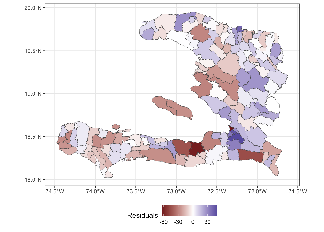
Visualising in this way helps us see whether or not the residuals show a spatial pattern, indicating that we should consider a spatial random effect in the model to account for the variation not explained by the predictor variables.
Correlation of residuals
We wish to use Moran’s \(I\) to understand the spatial correlation. Load the spdep package so that we have access to the moran function. This function requires us to pass in a numeric vector and a listw object that represents the adjacency between the values of the vector as a list rather than as a matrix.
library(spdep)
adm2_listw <- mat2listw(adm2_nb, style = "B", zero.policy = TRUE)

moran(x = adm2_aug$.resid,# what is correlated?
      listw = adm2_listw, # how are the regions connected?
      n = nrow(adm2_nb),  # how many regions?
      S0 = sum(adm2_nb),  # how many connections are there?
      zero.policy = TRUE) # regions with no neighbours contribute 0
## $I
## [1] 0.14933
##
## $K
## [1] 4.009779Unused variables
We haven’t used the urbanicity of the population in our model yet, and this may help us explain some of the leftover spatial variability. After all, the urbanicity varies spatially.
ggplot(data = adm2) +
    geom_sf(aes(fill=urbanpct)) +
    theme_bw() +
    scale_fill_viridis_c(
      name = "Proportion of population living in urban area",
                         limits = c(0,1)) +
    theme(legend.position = "bottom")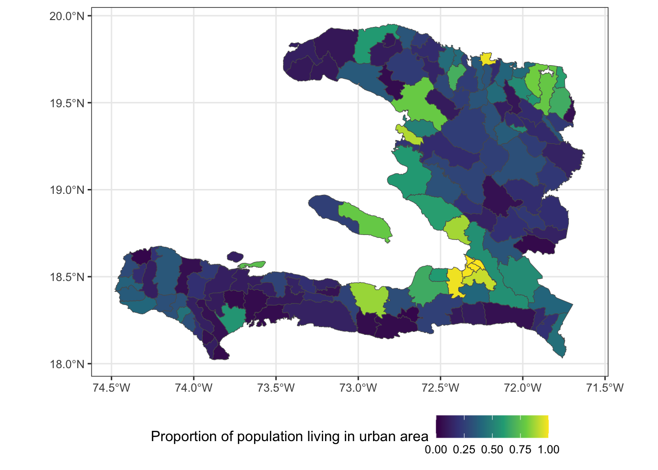
Let’s check to see if there’s any correlation between the residuals and the urbanicity, as this will help us determine whether it’s worth including in the model. We don’t need to carry the simple feature properties through the calculation, so first convert to a data frame then calculate the correlation between the residuals and urbanpct.
summarise(as.data.frame(adm2_aug),
          r = cor(.resid, urbanpct))
## r
## 1 0.1649016Exercise 5
- Fit a logistic regression model with
urbanpctas a predictor variable. - What unit is
urbanpctmeasured in? - Calculate the Odds ratio of
urbanpctand its 95% confidence interval for each unit increase - Use a calculation within the function
I()(which inhibits the conversion of objects) so thaturbanpctis in units of 10%. - Refit the model and calculate the Odds ratio.
## # A tibble: 1 × 4
##   term     estimate conf.low conf.high
##   <chr>       <dbl>    <dbl>     <dbl>
## 1 urbanpct     1.97     1.92      2.01
## # A tibble: 1 × 4
## term estimate conf.low conf.high
## <chr> <dbl> <dbl> <dbl>
## 1 I(urbanpct * 10) 1.07 1.07 1.07NB: Regarding the Odds Ratios, \(1.07^{10} \approx 1.97\)
Exercise 6
- Extract the residuals from the
urbanpctmodel - Add the residuals to the
data.frameperhaps calledurban_res - Map the
urban_resresiduals. - After fitting the model with one spatially varying variable, does it appear that there is any leftover spatial variability in the model?
Areal spatial regression models
The spatial models we will consider here are the IID random effect and a Markov Random Field specified on the neighbourhood structure of the adm2code variable in our simple feature data frame.
IID spatial random effect
We can pass mgcv::gam() a random effect with s(x, bs="re") to tell it that we want to consider a random intercept for each level of the \(x\) variable. In this case, we consider each of the adm1code values to have its own random intercept. We can’t use adm2code for a random effect intercept because the model would be over-parameterised, as we only have one observation for each level of adm2code.
library(mgcv)
adm2 <- mutate(adm2,
               adm1code = factor(adm1code))

iid_urbanpct <- gam(p ~ 1 + urbanpct +
                      s(adm1code, bs="re"),
                    data = adm2,
                    family = "binomial",
                    weights = vacc_denom)

summary(iid_urbanpct)
##
## Family: binomial
## Link function: logit
##
## Formula:
## p ~ 1 + urbanpct + s(adm1code, bs = "re")
##
## Parametric coefficients:
## Estimate Std. Error z value Pr(>|z|)
## (Intercept) 0.32980 0.08978 3.673 0.000239 ***
## urbanpct 1.08067 0.01759 61.421 < 2e-16 ***
## ---
## Signif. codes: 0 '***' 0.001 '**' 0.01 '*' 0.05 '.' 0.1 ' ' 1
##
## Approximate significance of smooth terms:
## edf Ref.df Chi.sq p-value
## s(adm1code) 8.971 9 6568 <2e-16 ***
## ---
## Signif. codes: 0 '***' 0.001 '**' 0.01 '*' 0.05 '.' 0.1 ' ' 1
##
## R-sq.(adj) = 0.155 Deviance explained = 22.1%
## UBRE = 273.6 Scale est. = 1 n = 138Markov random field
The Markov random field smoothers assumes that adjacent regions (defined by a neighbourhood) are more similar than non-adjacent regions.
We tell mgcv::gam() that we want to specify a smooth effect which can either be an iid random effect, s(..., bs="re"), or makes use of the adjacency information
We don’t have to pass in the adm2_polygons object, but R can plot an MRF smooth when asked to plot a gam object if and only if a set of polygons is provided. Remember, we can pass s(bs = "mrf", ...) either a penalty matrix (\(W\)), a list of polygons or a named list describing the neighbourhood structure.
library(mgcv)

adm2 <- mutate(adm2,
               adm2code = factor(adm2code),
               REGION_ID = levels(adm2code))


nb_adm2 <- adm2 %>%
    st_transform(crs = "+proj=utm +zone=18 ellps=WGS84") %>%
    st_queen(sparse=FALSE)

W_adm2 <- diag(rowSums(nb_adm2)) -nb_adm2

adm2_polygons <- st_coordinates(adm2) %>%
  as.data.frame %>%
  select(X, Y, L3) %>%
  split(.$L3) %>%
  map(~as.matrix(.x[,c(1,2)]))

names(adm2_polygons) <- adm2$adm2code

mrf_urbanpct <- gam(p ~ 1 + urbanpct +
                      s(adm2code,
                        bs="mrf", k = 100,
                        xt = list(penalty = nb_adm2,
                                  polys = adm2_polygons)),
                    data = adm2,
                    family = "binomial",
                    weights = vacc_denom)

plot(mrf_urbanpct)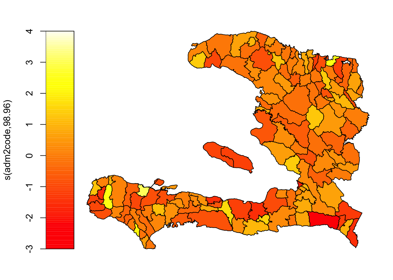
Instead, let’s use ggplot2 to visualise this so we have finer control over things like the colour scale and its midpoint, and axis labelling.
adm2 <- mutate(adm2,
  mrf =
    c(# need to coerce to a vector to store in the data frame
      predict(object = mrf_urbanpct,
              newdata = adm2,
              type = "terms", # we want a prediction of the random effect
                              # alternatively we can ask for predictions on
                              # the scale of the response or the link
              terms = "s(adm2code)") # only show the contribution of spatial random effect
    )
)

ggplot(data=adm2) +
    geom_sf(aes(fill = mrf)) +
    scale_fill_gradient2(midpoint = 0,
                       name = "Spatial random effect") +
    theme_bw() + theme(legend.position = "bottom")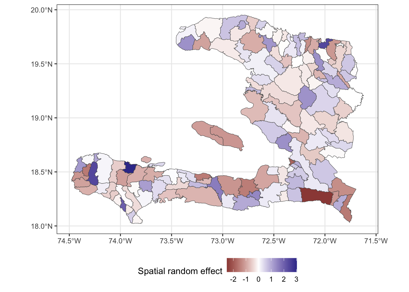
The above plot shows us the value of spatial random effect for each region in our model.
Comparing the fit of the models
Effect of covariates
Because we have included the spatial random effect in our model, we should check to see what has happened to our estimate of the effect of urbanicity. Has it stayed the same? Changed? If it has changed, does it still lead to an increase in vaccine coverage? You can check with the confint function to extract confidence intervals. Or if you wish to use the tidy function, (hint: set parametric = TRUE) you can reconstruct the confidence interval from the estimate and standard error then convert the parameter estimates to odds ratios by exponentiating.
| Model | estimate | 2.5% | 97.5% |
|---|---|---|---|
| Generalised Linear Model | 1.97 | 1.92 | 2.01 |
| Markov Random Field | 1.73 | 1.67 | 1.80 |
| IID on level 1 | 2.95 | 2.85 | 3.05 |
Fitted values
We can extract the fitted values from our model objects by augmenting the data frame and examining the .fitted column or by calling the fitted() function on the object. Make sure you extract the fitted values of the "response" type. If you extract the fitted values on the scale of the linear predictor, ensure you transform using the inverse link function to obtain the predictions on the response scale.
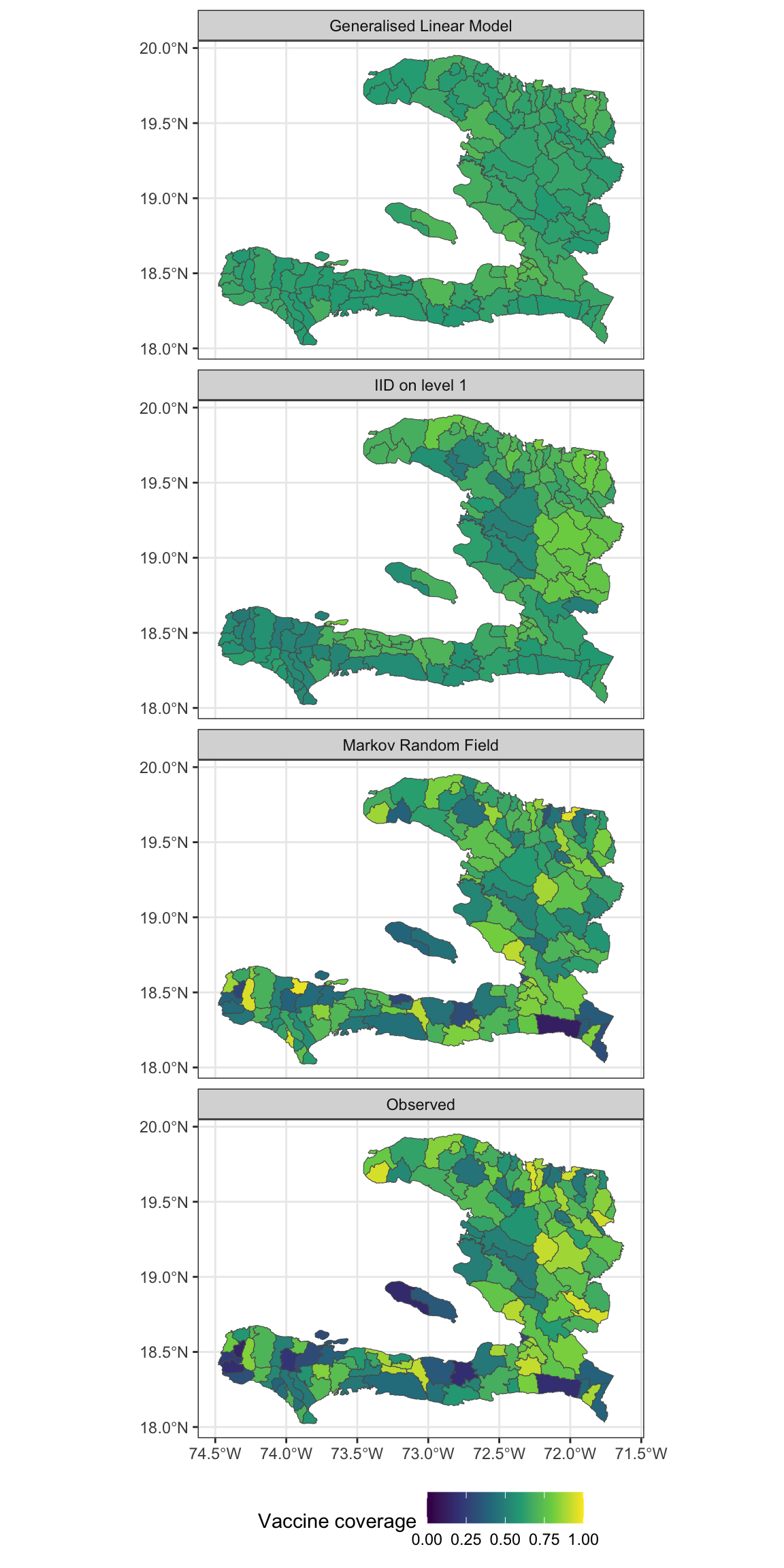
Exercise 7
- Extract the fitted values and add them to the data frame containing the adm2 data
- Reshape the data frame to prepare for visualisation of the observed values as well as the predictions from the models with and without the MRF smooth.
- Make a visualisation with small multiples that shows the fitted values and observed values
Residuals
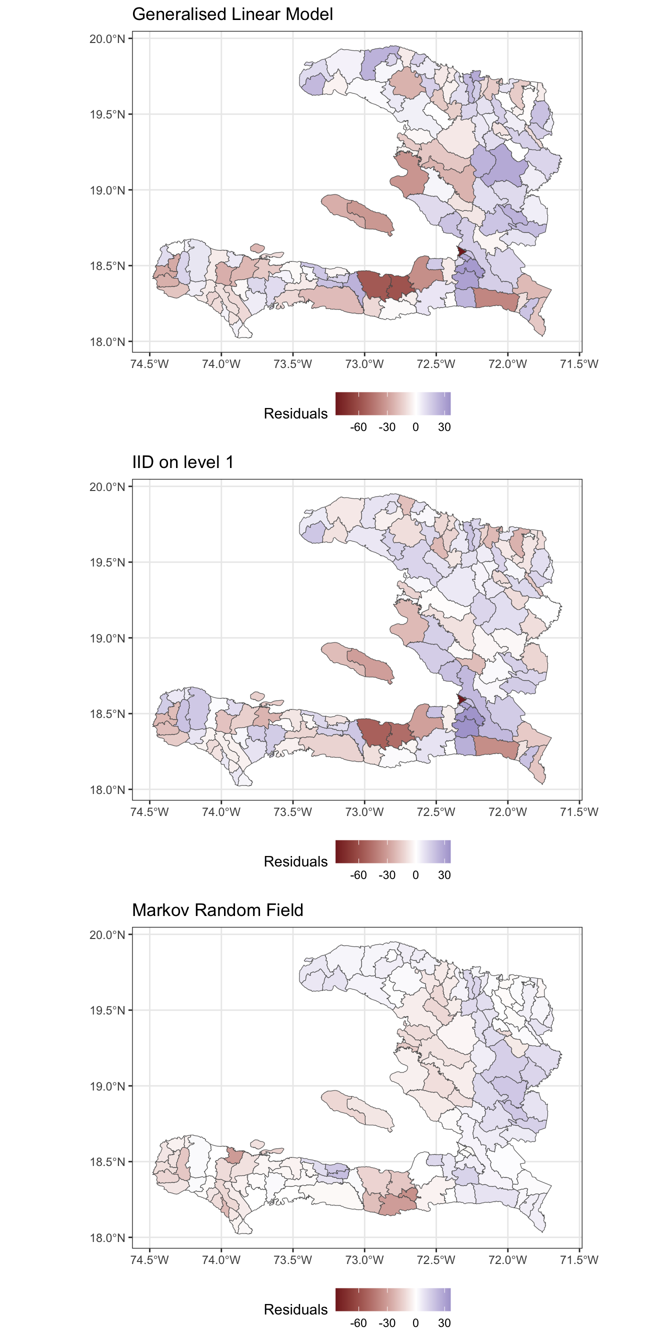
Rather than only visually comparing the difference between predictions and observed values, let’s consider the actual residuals from the models.
Exercise 8
- Extract the residuals from the fitted model objects
- Reshape the data frame appropriately so that we have a long format data frame
- Create a spatial visualisation for the residuals from each model
- Create a scatterplot showing how the fitted values (on the link scale) vary with the empirical logit, to show how close the predictions are to the data
Exercise 9
Calculate the spatial correlation of the residuals from these two models
Calculate the standard deviation of the residuals to show how much leftover variation there is.
| Model | I | sd | AIC |
|---|---|---|---|
| Generalised Linear Model | 0.121 | 17.994 | 45874.72 |
| Markov Random Field | 0.633 | 9.388 | 12199.29 |
| IID on level 1 | 0.022 | 16.607 | 38913.11 |
- Which of these models best accounts for the spatial variability in the data and why?
Extension exercises
Exercise 10
Modify the code above to conduct the analysis for an MRF spatial effect for the administrative regions in the adm1code variable and compare the effect of urbanicity, residuals and AIC to the model with the MRF for the adm2code variable.
Exercise 11
- Investigate which of the regions in the
adm2data set have zero neighbours or do not appear to be connected to their neighbours properly and determine an appropriate set of neighbours for them - Modify the weights matrix to include these neighbours
- Refit the models and assess the goodness of fit and correlation of the residuals