Packages
# Load the packages needed for this practical
if (!require("pacman")) install.packages("pacman")
pkgs = c("sf",
         "scales",
         "mgcv",
         "tidyverse", "magrittr")
pacman::p_load(pkgs, character.only = T)
Refresher - linear models
Reading data in and visualising
Load the tidyverse package and read in the rats data. Ensure that the ID column is a factor
library(tidyverse)
rats_df <- read_csv("./data/rats/rats.csv",
col_types = list(ID = 'f'))rats_df## # A tibble: 150 × 3
## ID time weight
## <fct> <dbl> <dbl>
## 1 1 8 151
## 2 2 8 145
## 3 3 8 147
## 4 4 8 155
## 5 5 8 135
## 6 6 8 159
## 7 7 8 141
## 8 8 8 159
## 9 9 8 177
## 10 10 8 134
## # ℹ 140 more rowsggplot(data = rats_df,
aes(x = time, y = weight)) +
geom_line(aes(group = ID)) +
theme_minimal() +
xlab("Time (days)") +
ylab("Weight (grain?)")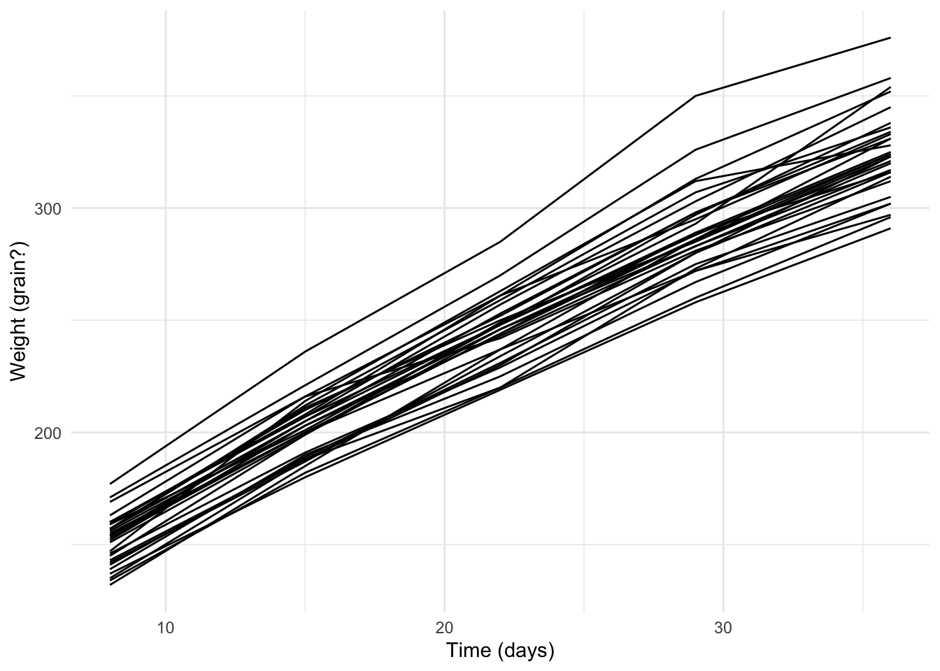
Exercise: Fit a model showing the weight of the rats as a function of their age
rats_lm <- lm(data = rats_df,
              weight ~ time)
Exercise: Look at the model summary() to determine whether or not there’s statistical evidence that the rats’ age affects their weight
summary(rats_lm)##
## Call:
## lm(formula = weight ~ time, data = rats_df)
##
## Residuals:
## Min 1Q Median 3Q Max
## -38.253 -11.278 0.197 7.647 64.047
##
## Coefficients:
## Estimate Std. Error t value Pr(>|t|)
## (Intercept) 106.5676 3.2099 33.20 <2e-16 ***
## time 6.1857 0.1331 46.49 <2e-16 ***
## ---
## Signif. codes: 0 '***' 0.001 '**' 0.01 '*' 0.05 '.' 0.1 ' ' 1
##
## Residual standard error: 16.13 on 148 degrees of freedom
## Multiple R-squared: 0.9359, Adjusted R-squared: 0.9355
## F-statistic: 2161 on 1 and 148 DF, p-value: < 2.2e-16Here we see that the \(p\) value for the effect of time is very small and so reject the null hypothesis that there is no effect. Similarly, the \(R^2\) value for the fitted model, with only one explanatory variable, is 0.94 which indicates a strong linear relationship.
Diagnostics
Exercise: Use the residuals() and fitted() functions to extract the residuals and fitted values from the model and add them to the rats_df data frame.
rats_df %<>% mutate(residuals = residuals(rats_lm))
rats_df %<>% mutate(fitted    = fitted(rats_lm))
Exercise: Plot the residuals against the fitted values.
ggplot(data = rats_df,
       aes(x = fitted,
           y = residuals)) +
  geom_point() +
  theme_minimal() + geom_smooth(se = FALSE)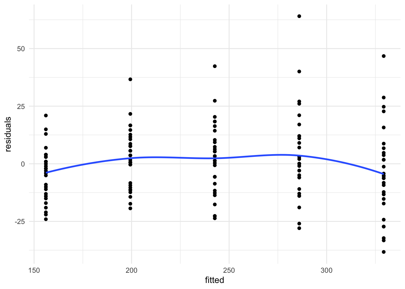
Exercise: Do the residuals look IID with, as we move from left to right, the same variance and a mean of 0?
No, the variance increases for larger fitted values and there appears to be some curvature to the residuals with a peak in the middle group
GLMs
Remember that Generalised Linear Models (GLMs) relate the observed outcome variable, \(\boldsymbol{Y}\), to the explanatory variables, \({X}\), through a link function, \(g(\cdot)\) and coefficients, \(\boldsymbol{\beta}\).
\[ g\left(\mathbb{E}(\boldsymbol{y})\right) = X\boldsymbol{\beta} \]
Here, \(g(\cdot)\) is the link between
the expected outcome, \(\mathbb{E}(\boldsymbol{y})\), and
the linear predictor, \(X\boldsymbol{\beta}\), a linear combination of the variables used to predict the outcome
In the following exercises, you’ll need to make sure you specify the family of model you wish to use (e.g. poisson, binomial) otherwise glm() defaults to using a Gaussian/normal model and will give the equivalent to lm()
A Binomial example
Loading and visualising data
We will consider data from Haiti on vaccine coverage for the tri-valent diphtheria-tetanus-pertussis vaccine in 2016. Make a fresh script and load the data (stored in geojson format).
library(sf)
adm2 <- st_read('adm2.geojson',
                stringsAsFactors = F,
                quiet = TRUE)
Exercise: Make a plot showing the relationship between the included dtp3coverage2016 and urbanpct variables. This variable is the proportion of people living in urban areas in the given arrondissement (level 2 admin unit). Include a scatterplot smoother to help visualise the relationship.
adm2_urb_plot <-
  ggplot(data = adm2,
       aes(x = urbanpct,
           y = dtp3coverage2016/100)) +
  geom_point() +
  xlab("Population living in urban areas") +
  ylab("Population vaccinated with DTP3") +
  scale_y_continuous(limits = c(0,1),
                     labels = percent_format()) +
  scale_x_continuous(limits = c(0,1),
                     labels = percent_format()) +
  theme_minimal()

adm2_urb_plot +
  geom_smooth(method = 'loess',
              fill   = 'purple',
              color  = 'purple',
              alpha  = 0.25)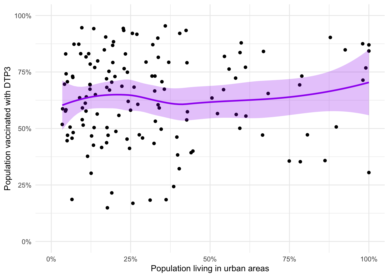
The loess smooth (locally weighted polynomial regression) doesn’t replace the need for a model. There may be a relationship but we can’t dismiss or accept it without modelling.
Model fitting
In order to fit the model, we need to tell glm() how many successes and failures we had. In the data frame, the relevant variables are
vacc_num- numerator for vaccine coverage, \(y\)vacc_denom- denominator for vaccine coverage, \(n\)urbanpct- proportion (not percentage) explanatory variable, \(x\)
So our number of failures is
adm2 <- mutate(adm2, vacc_fail = vacc_denom - vacc_num)and the model call is
adm2_binom <- glm(data = adm2,
                  cbind(vacc_num, vacc_fail) ~ urbanpct,
                  family = 'binomial')
Diagnostics
Exercise: Show the model summary
summary(adm2_binom)##
## Call:
## glm(formula = cbind(vacc_num, vacc_fail) ~ urbanpct, family = "binomial",
## data = adm2)
##
## Deviance Residuals:
## Min 1Q Median 3Q Max
## -77.242 -8.782 1.858 12.611 35.249
##
## Coefficients:
## Estimate Std. Error z value Pr(>|z|)
## (Intercept) 0.360855 0.006778 53.24 <2e-16 ***
## urbanpct 0.675942 0.011145 60.65 <2e-16 ***
## ---
## Signif. codes: 0 '***' 0.001 '**' 0.01 '*' 0.05 '.' 0.1 ' ' 1
##
## (Dispersion parameter for binomial family taken to be 1)
##
## Null deviance: 48588 on 137 degrees of freedom
## Residual deviance: 44852 on 136 degrees of freedom
## AIC: 45875
##
## Number of Fisher Scoring iterations: 4Looking at the output of our fitted model we can see that the urbanpct variable appears to explain some of the variability in vaccine coverage (as the \(p\) value is \(< 2 \times 10^{-16}\)).
We can also ask for tidier model summaries either as a data frame for the coefficients
library(broom)
tidy(adm2_binom, conf.int = TRUE)
## # A tibble: 2 × 7
## term estimate std.error statistic p.value conf.low conf.high
## <chr> <dbl> <dbl> <dbl> <dbl> <dbl> <dbl>
## 1 (Intercept) 0.361 0.00678 53.2 0 0.348 0.374
## 2 urbanpct 0.676 0.0111 60.7 0 0.654 0.698or the model diagnostics
glance(adm2_binom)## # A tibble: 1 × 8
## null.deviance df.null logLik AIC BIC deviance df.residual nobs
## <dbl> <int> <dbl> <dbl> <dbl> <dbl> <int> <int>
## 1 48588. 137 -22935. 45875. 45881. 44852. 136 138Prediction
Our observed range of proportion of each region living in an urban area is (0.03, 1) which covers both almost completely urban and almost completely rural areas.
If we want to know what the predicted vaccine coverage was for each region, we can ask for the fitted values from our model
head(fitted.values(adm2_binom)) # this is the first six of 138## 1 2 3 4 5 6
## 0.7369700 0.7382314 0.7357776 0.7283702 0.6534550 0.6824575or use the predict() function on the fitted model
head(predict(adm2_binom, type = 'response'))## 1 2 3 4 5 6
## 0.7369700 0.7382314 0.7357776 0.7283702 0.6534550 0.6824575One of the easiest ways to do this is to use the augment() function from the broom package. It gives us a data frame with the variables used to fit the model and a number of model diagnostics.
rats_aug <- augment(rats_lm)
head(rats_aug)
## # A tibble: 6 × 8
## weight time .fitted .resid .hat .sigma .cooksd .std.resid
## <dbl> <dbl> <dbl> <dbl> <dbl> <dbl> <dbl> <dbl>
## 1 151 8 156. -5.05 0.0200 16.2 0.00102 -0.316
## 2 145 8 156. -11.1 0.02 16.2 0.00489 -0.692
## 3 147 8 156. -9.05 0.0200 16.2 0.00328 -0.567
## 4 155 8 156. -1.05 0.0200 16.2 0.0000444 -0.0660
## 5 135 8 156. -21.1 0.0200 16.1 0.0177 -1.32
## 6 159 8 156. 2.95 0.0200 16.2 0.000347 0.185We need to specify what type of predictions we want, as the default behaviour is to return them on the link (here, logit) scale
head(predict(adm2_binom))## 1 2 3 4 5 6
## 1.0302790 1.0367966 1.0241369 0.9863693 0.6342611 0.7650887and we see that some predicted values are \(> 1\) which means these can’t possibly be predicted proportions.
Exercise: Add the predicted values (on the response scale) to the adm2 data frame and make a plot showing the predicted and observed values.
adm2 <- mutate(adm2,
               coverage_pred = predict(object  = adm2_binom,
                                       newdata = adm2,
                                       type    = 'response'))

ggplot(data= adm2,
       aes(x = vacc_num/vacc_denom, y = coverage_pred)) +
  geom_point() +
  xlab('Observed') + ylab('Predicted') +
  theme_minimal() +
  geom_abline(intercept = 0, slope = 1) +
  scale_x_continuous(limits = c(0,1), labels = percent_format()) +
  scale_y_continuous(limits = c(0,1), labels = percent_format()) +
  coord_equal()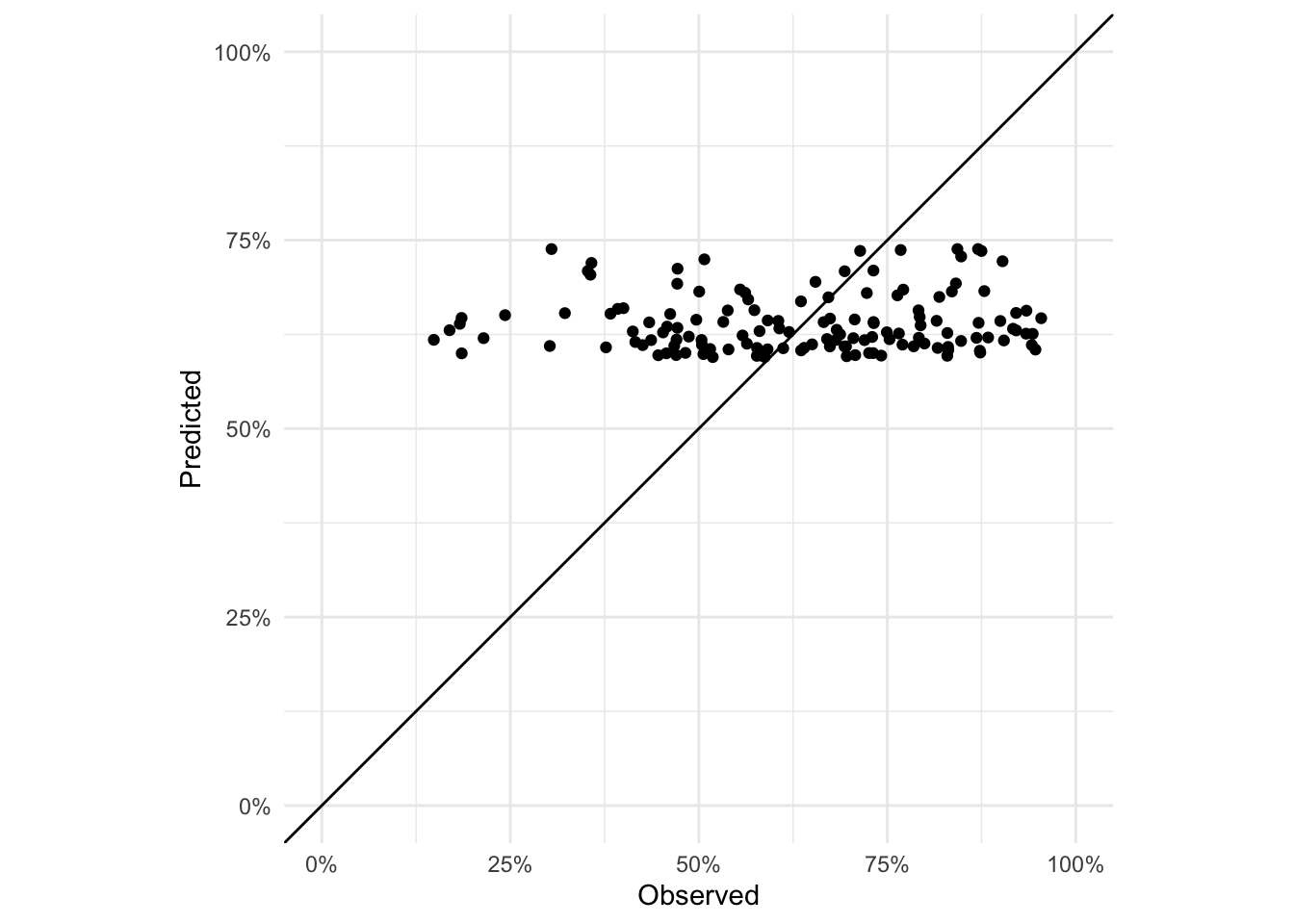
If the model perfectly predicted vaccine coverage, all the points would lie on the 1:1 line. Not much of the variability is captured as the predicted values are all in the range (0.59, 0.74) even though the range of observed vaccine coverages is (0.15, 0.95).
We should also consider plotting the model and the observed data as in our scatterplot before. We will first build a prediction data frame that contains the values of urbanpct we wish to predict at. Here we want the full range from 0 to 1 with enough resolution that our resulting plot looks like a smooth line.
adm2_pred <- data.frame(
  urbanpct = seq(from       = 0,
                 to         = 1,
                 length.out = 101))

adm2_pred %<>% mutate(
  coverage_pred = predict(object  = adm2_binom,
                          newdata = .,
                          type    = 'response'))
adm2_urb_plot +
geom_line(data = adm2_pred,
aes(x = urbanpct,
y = coverage_pred),
color = 'purple') +
coord_equal()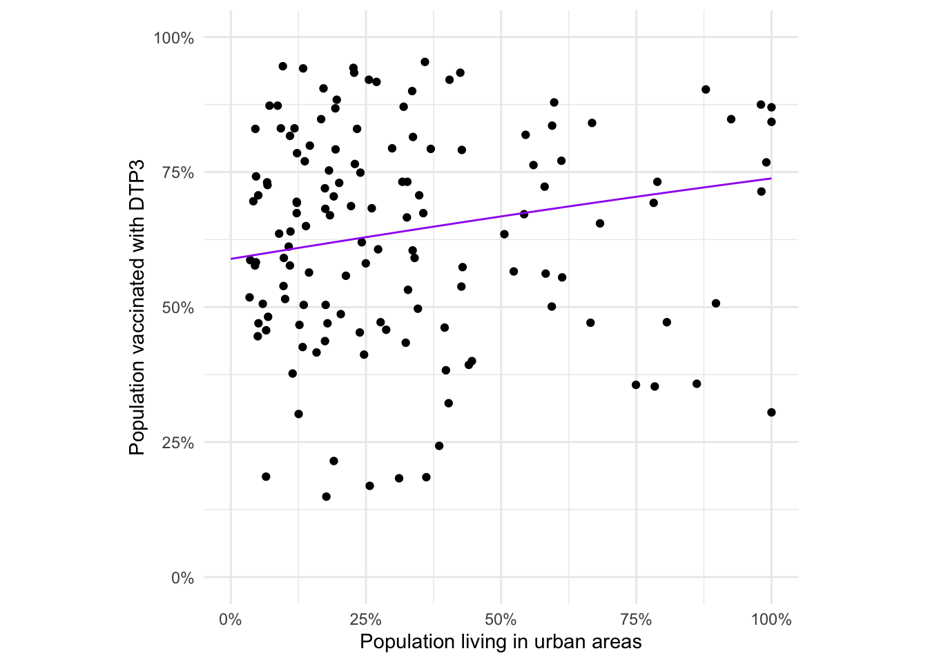
We also see from this plot that there’s a lot of variability around our predicted function that describes coverage as a function of urbanicity. Although that was clear from the earlier scatterplot, too.
Exercise: Create a spatial visualisation of the residuals (on the logit scale). Discuss whether they appear to be IID with correlation of 0.
adm2_binom_resid <- mutate(adm2,
                             residuals = residuals(adm2_binom))


ggplot(data = adm2_binom_resid) +
  geom_sf(aes(fill = residuals)) +
  scale_fill_gradient2(midpoint = 0, name="Residuals") +
  theme_void() + theme(axis.text = element_blank())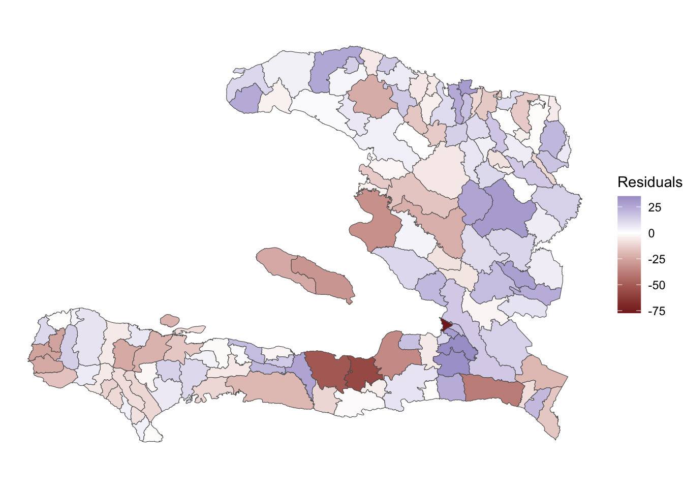
The residuals exhibit some spatial clustering of red and blue patches, indicating that there might be spatial variation in the data apart from that which is captured by urbanicity.
Extension exercise: Calculate the relative risk of vaccine coverage for a completely rural vs a completely urban population, given by finding the ratio of the probabilities in each.
RR <-
  head(adm2_pred$coverage_pred,1)/
  tail(adm2_pred$coverage_pred,1)

round(RR, 2)
## 1
## 0.8So individuals in fully rural regions are 20% less likely to have received the vaccine than those in fully urban areas.
Extension exercise: Fit a Poisson GLM to the vaccine coverage data. The offset variable to be used is the vacc_exp, which is derived from the proportion of vaccinees expected to be found in each arrondissement if the coverage was equal.
adm2_poisson <- glm(data = adm2, vacc_num ~ offset(log(vacc_exp)) + urbanpct,
                    family = 'poisson')

summary(adm2_poisson)
##
## Call:
## glm(formula = vacc_num ~ offset(log(vacc_exp)) + urbanpct, family = "poisson",
## data = adm2)
##
## Deviance Residuals:
## Min 1Q Median 3Q Max
## -49.086 -5.849 1.138 7.044 17.191
##
## Coefficients:
## Estimate Std. Error z value Pr(>|z|)
## (Intercept) -0.119139 0.004116 -28.95 <2e-16 ***
## urbanpct 0.218862 0.006266 34.93 <2e-16 ***
## ---
## Signif. codes: 0 '***' 0.001 '**' 0.01 '*' 0.05 '.' 0.1 ' ' 1
##
## (Dispersion parameter for poisson family taken to be 1)
##
## Null deviance: 17736 on 137 degrees of freedom
## Residual deviance: 16518 on 136 degrees of freedom
## AIC: 17705
##
## Number of Fisher Scoring iterations: 4Extension exercise: Calculate the change in risk (relative) associated with a change from urbanicity of 1 to 0 by exponentiating the coefficient.
tidy(adm2_poisson, conf.int = TRUE) %>%
  filter(term == 'urbanpct') %>%
  select(estimate, conf.low, conf.high) %>%
  mutate_all(.funs = ~{1 - exp(-.)})
## # A tibble: 1 × 3
## estimate conf.low conf.high
## <dbl> <dbl> <dbl>
## 1 0.197 0.187 0.206Again, about 20% less likely.