Packages
# Load the packages needed for this practical
if (!require("pacman")) install.packages("pacman")
pkgs = c("sf",
         "scales",
         "mgcv",
         "tidyverse",
         "magrittr")
pacman::p_load(pkgs, character.only = T)
GAMs
Loading data
Exercise: Start a new script, and load the Haiti vaccine coverage data.
adm2 <- st_read("adm2.geojson",
                stringsAsFactors = F, quiet = TRUE)
Model fitting
Exercise: Fit a GAM to the vaccine coverage with a smooth term, using the mgcv package.
library(mgcv)
adm2 %<>% mutate(vacc_fail = vacc_denom - vacc_num)

adm2_gam <- gam(data = adm2,
                cbind(vacc_num, vacc_fail) ~ s(urbanpct),
                family = 'binomial')
Exercise: Plot the resulting smooth line of best fit (with plot()). Does this look like a plausible shape for the relationship between urban population percentage and vaccine coverage?
plot(adm2_gam)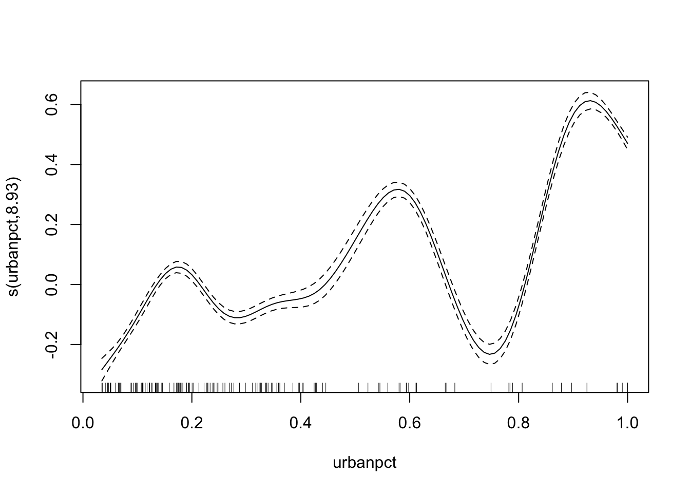
Look at the number of degrees of freedom in the model summary (or plot). We should try to use fewer degrees of freedom to simplify the curve while still allowing more flexibility than a linear term (on the logit scale).
Exercise: Re-fit the model but specify a fixed value of k for the smooth term. Plot the result.
adm2_gam <- gam(data = adm2,
                cbind(vacc_num, vacc_fail) ~ s(urbanpct, k = 4),
                family = 'binomial')

plot(adm2_gam)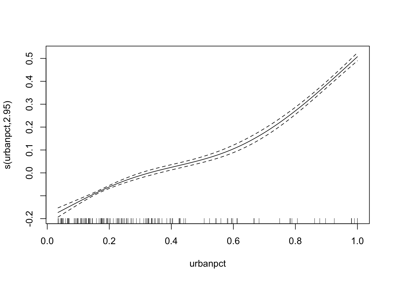
Exercise: Does this look like a plausible shape for the relationship between urban population percentage and vaccine coverage?
The function is monotonically increasing, like the linear function from the GLM before, and is better supported than a linear function as if it were more linear the smooth function would be smoothed to that.
Predicting
Exercise: Once you are satisfied with the smooth term of your model, build a data frame with predictions (on the response scale!) and visualise the line of best fit along with the data.
adm2_pred <- data.frame(urbanpct = seq(0,1,by = 0.01))

adm2_pred %<>% mutate(fit = predict(adm2_gam, newdata = adm2_pred, type = 'response'))

ggplot(data = adm2,
       aes(y = vacc_num/vacc_denom, x = urbanpct)) +
  geom_point() +
  geom_line(data= adm2_pred,
            aes(y = fit),
            color = 'purple') +
  xlab("Population living in urban areas") +
  ylab("Population vaccinated with DTP3") +
  scale_y_continuous(limits = c(0,1),
                     labels = percent_format()) +
  scale_x_continuous(limits = c(0,1),
                     labels = percent_format()) +
theme_minimal() 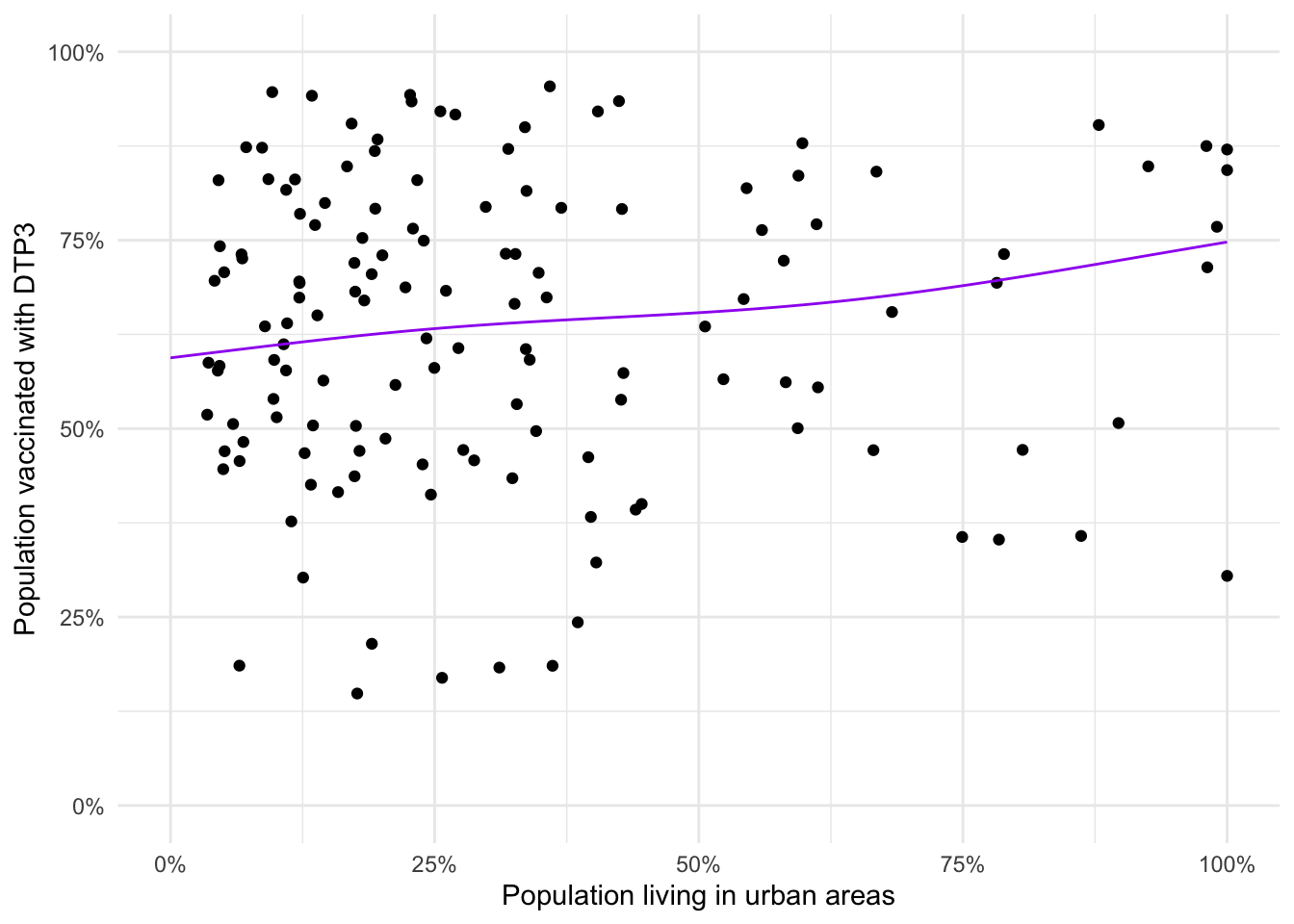
Exercise: Discuss any differences between this model’s predictions and the predictions from the GLM.
There’s not much difference in the resulting lines of best fit as they start and end at the same vaccine coverage and there’s not a lot of variation in the middle.
Model comparison
Exercise: Extract the AICs for both the GLM and GAM models and discuss which is the better one.
adm2_glm <- gam(data = adm2,
                cbind(vacc_num, vacc_fail) ~ urbanpct,
                family = 'binomial')

list(`GLM` = adm2_glm,
     `GAM` = adm2_gam) %>%
  map_df(glance, .id = "Model")
## # A tibble: 2 × 8
## Model df logLik AIC BIC deviance df.residual nobs
## <chr> <dbl> <dbl> <dbl> <dbl> <dbl> <dbl> <int>
## 1 GLM 2 -22935. 45875. 45881. 44852. 136 138
## 2 GAM 3.95 -22874. 45757. 45768. 44730. 134. 138# or
lapply(X = list(`GLM` = adm2_glm,
`GAM` = adm2_gam),
FUN = extractAIC)## $GLM
## [1] 2.00 45874.72
##
## $GAM
## [1] 3.951428 45756.535789The GAM has a lower AIC than the GLM by a substantial amount (118). Compared to the penalty from the increased number of parameters (\(2 \times (3.95 - 2) = 3.9\)) this is a good improvement in goodness of fit, and so we conclude it is better.
Exercise: Discuss whether you believe it’s better to use a GAM or a GLM for this data analysis.
Either choice is defensible! If all that matters is prediction accuracy, the GAM might be better. However for a more interpretable model (e.g. calculating relative risks) the GLM’s simplicity makes it easier to work with. Always check that the model you’re fitting can be defended.
Extensions
Extension exercise: Build a data frame of predictions that contains the 95% confidence interval for the fitted smooth (derived from the standard errors). Add a ribbon to your plot of the predicted relationship between urbanicity and vaccine coverage.
adm2_pred <- data.frame(urbanpct = seq(0, 1, by = 0.01))

adm2_predictions <- as.data.frame(predict(object = adm2_gam,
                                          newdata = adm2_pred,
                                          se = T))

adm2_predictions <- bind_cols(adm2_pred, adm2_predictions) %>%
  mutate(L = boot::inv.logit(fit - 1.96*se.fit),
         U = boot::inv.logit(fit + 1.96*se.fit),
         M = boot::inv.logit(fit))

ggplot(data = adm2_predictions,
       aes(x = urbanpct, y = M)) +
  geom_ribbon(aes(ymin = L,
                  ymax = U),
              fill = 'purple',
              alpha = 0.2) +
  geom_line() +
  theme_minimal() +
  scale_x_continuous(labels = percent_format(),
                     name = "Population living in urban areas") +
  scale_y_continuous(labels = percent_format(), limits = c(0,1),
                     name = "Vaccine coverage in target population") +
  geom_point(data = adm2, aes(y = vacc_num/vacc_denom))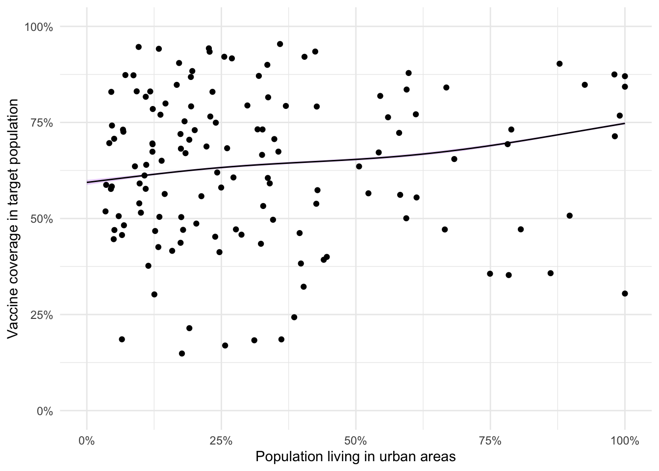
Extension exercise: Using plot function to visualise the fitted smooth term and its 95% confidence interval.
plot(adm2_gam,
     xlab = "Proportion of population living in urban areas",
     ylab = "Partial effect",
     shade = T,
     shade.col = "plum3")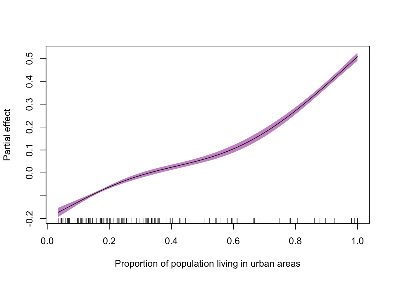
GLMMs
Rats data
Loading data
Consider the rat data again,
rats_df <- read_csv("./data/rats/rats.csv",
                    col_types = list(ID = 'f'))
Model fitting
To fit a model where each rat has its own intercept we will use the mgcv package (Wood 2017) which allows us to use the same arguments as a call to nlme’s functions.
Here, that looks like
library(mgcv)
rats_glmm <- gamm(data     = rats_df,
                  formula  = weight ~ time,
                  random   = list(ID = ~1))
Model diagnostics
Looking at the model summary. You should see that the object contains a lme object and a gam object. These are identical model fits including both random and fixed effects. We will be working with lme in the rest of this exercise.
summary(rats_glmm)## Length Class Mode
## lme 18 lme list
## gam 30 gam listExercise: If we apply the summary() function to the linear mixed effects component ($lme), we get lots of information.
summary(rats_glmm$lme)## Linear mixed-effects model fit by maximum likelihood
## Data: strip.offset(mf)
## AIC BIC logLik
## 1145.517 1157.56 -568.7587
##
## Random effects:
## Formula: ~1 | ID
## (Intercept) Residual
## StdDev: 13.78541 8.16956
##
## Fixed effects: y ~ X - 1
## Value Std.Error DF t-value p-value
## X(Intercept) 106.56762 3.0163427 119 35.33008 0
## Xtime 6.18571 0.0678351 119 91.18745 0
## Correlation:
## X(Int)
## Xtime -0.495
##
## Standardized Within-Group Residuals:
## Min Q1 Med Q3 Max
## -2.7524197 -0.4788094 0.1250318 0.5646717 3.0192705
##
## Number of Observations: 150
## Number of Groups: 30We can see that the standard deviation of the random intercept is about 14, and that the coefficients from the model are the same as the linear model but that we have smaller standard errors. This is because we account for some of the uncertainty in the observed data with the random effect.
If we look at the residuals from this model, we can see what the inclusion of a rat-specific intercept does. We must use the $lme object for this.
rats_df %<>% mutate(residuals_glmm = residuals(rats_glmm$lme),
                    fitted_glmm    = fitted(rats_glmm$lme))
ggplot(data = rats_df,
aes(x = fitted_glmm,
y = residuals_glmm)) +
geom_point() +
geom_line(aes(group = ID)) +
theme_minimal() +
geom_smooth()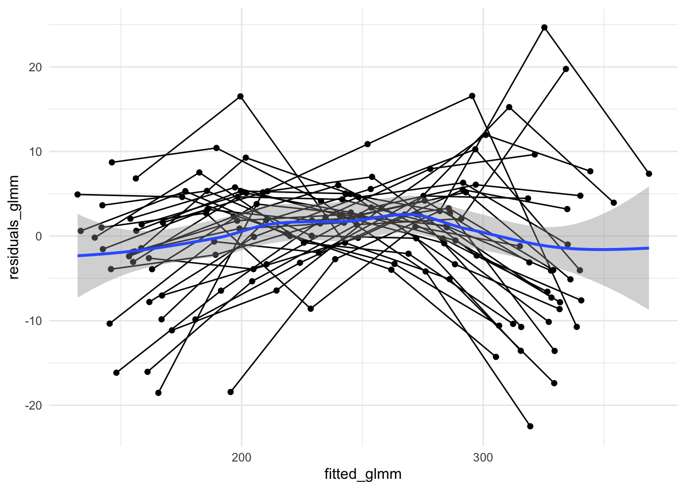
Exercise: Do the residuals here look IID?
Here there may still be structure in the residuals due to each rat potentially having its own growth rate. We certainly see that the variance (spread in y direction) is smallest towards fitted values of 250 but we have a trend which is closer to a mean of zero from left to right
Exercise: Compare the distribution of the residuals (and fitted values) between the original linear model and this GLMM.
Extensions
Extension exercise: Make a new GLMM (using gamm()) that contains both a random intercept and a random slope for age. Discuss the residuals and AIC.
rats_glmm2 <- gamm(data     = rats_df,
                   formula  = weight ~ time,
                   random   = list(ID = ~1 + time))

list(`Intercept only`      = rats_glmm,
     `Intercept and slope` = rats_glmm2) %>%
  map('lme') %>%
  map(extractAIC)
## $`Intercept only`
## [1] 4.000 1145.517
##
## $`Intercept and slope`
## [1] 6.000 1108.057The AIC for the fully random effects only model is lower than that of the intercept only mixed effects model. By including the random effect on growth rate, we have introduced a lot of flexibility into the model. The additional parameters (to do with the variance-covariance of the random effects) are well and truly worth it as the increased number of parameters is more than compensated for by the increased goodness of fit.
Extension exercise: Look at the structure of the fitted model object, specifically the $lme component. Extract the \(\boldsymbol{u}\) coefficients for the random intercept and plot a histogram. Do they appear normally distributed?
u <- as.data.frame(rats_glmm$lme$coefficients$random$ID)

u_hist <- ggplot(data = u, aes(x = `(Intercept)`)) +
  geom_histogram(binwidth = 5, boundary = 0,
                 fill = 'purple', color = 'black',
                 aes(y = after_stat(density))) +
  theme_minimal()

u_hist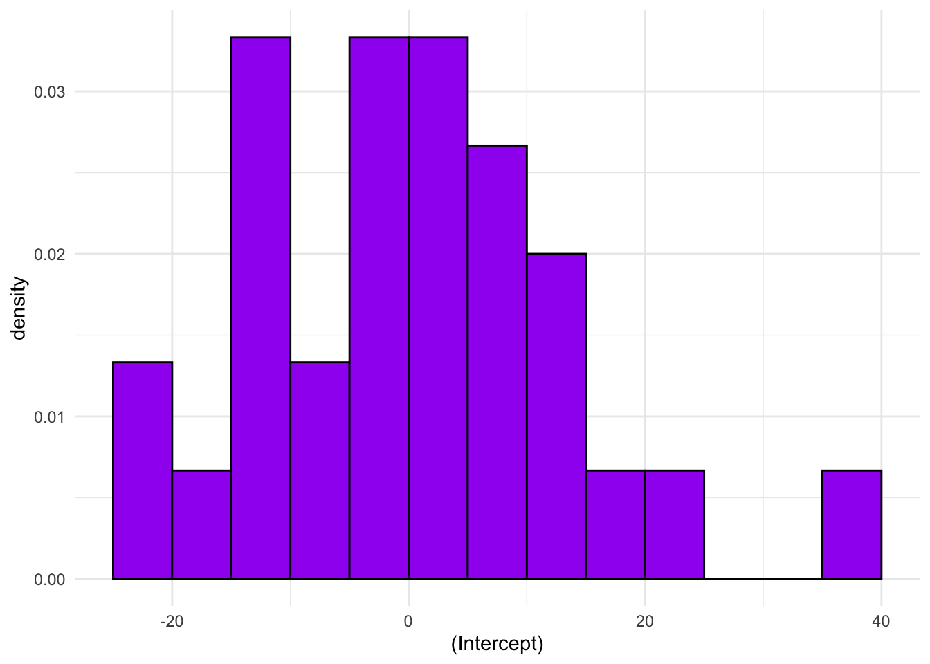
We only have 30 rats, so it’ll be difficult to get a sense of the distribution from such a small set of values. With bins as wide as 5, we see a peak in the middle and while it’s not completely symmetric it doesn’t seem excessively skewed.
Extension exercise: Extract the estimate of the standard deviation of the random effect from the model object and add a normal distribution to the histogram above.
u_hist +
  stat_function(fun  = dnorm,
                args = list(mean= 0, sd = 13.78),
                xlim = c(-40,40))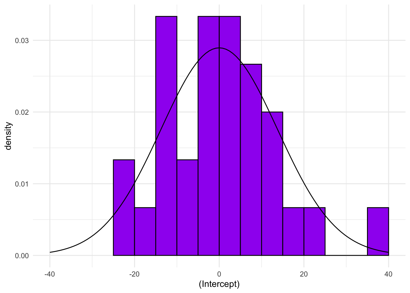
Extension exercise: Combine the ideas from the GAM and GLMM in order to fit a GAMM that has a spline term for growth and a random intercept for each rat.
rats_gamm <- gamm(data    = rats_df,
                  formula = weight ~ s(time, k = 4),
                  random  = list(ID = ~1))

rats_gamm
## $lme
## Linear mixed-effects model fit by maximum likelihood
## Data: strip.offset(mf)
## Log-likelihood: -559.6552
## Fixed: y ~ X - 1
## X(Intercept) Xs(time)Fx1
## 242.65333 60.16594
##
## Random effects:
## Formula: ~Xr - 1 | g
## Structure: pdIdnot
## Xr1 Xr2
## StdDev: 17.94507 17.94507
##
## Formula: ~1 | ID %in% g
## (Intercept) Residual
## StdDev: 13.87423 7.379509
##
## Number of Observations: 150
## Number of Groups:
## g ID %in% g
## 1 30
##
## $gam
##
## Family: gaussian
## Link function: identity
##
## Formula:
## weight ~ s(time, k = 4)
##
## Estimated degrees of freedom:
## 2.56 total = 3.56
##
##
## attr(,"class")
## [1] "gamm" "list"extractAIC(rats_gamm$lme)## [1] 5.00 1129.31The AIC here is higher than for the completely random effects model, incidating that the time variability is better dealt with by allowing each rat to have their own linear growth rate than assuming an overall smooth curve
Logistic regression
Loading data
Load the Haiti adm2 data and generate the number of unvaccinated individuals as we did earlier.
library(sf)
adm2 <- st_read('adm2.geojson', stringsAsFactors = F,
                quiet = TRUE)
adm2 <- mutate(adm2, vacc_fail = vacc_denom - vacc_num)The data set contains three levels of administrative region
- Nation
- Department
- Arrondissement
The Haiti data has vaccine coverage data for 138 arrondissements which are grouped as ten departments.
Model fitting
Exercise: Using the gamm() function, as above, fit a GLMM for vaccine coverage as a function of urbanicity to include a random effect for the level 1 administrative region.
adm2_binom_glmm <- gamm(data = adm2,
                        cbind(vacc_num, vacc_fail) ~ urbanpct,
                        family = binomial(),
                        random = list(adm1_en = ~1))
##
## Maximum number of PQL iterations: 20Model diagnostics
Exercise: Plot the fitted values against the observed (on the scale of the response variable)
adm2 %<>% mutate(predicted_logit = predict(adm2_binom_glmm$lme),
                 predicted       = boot::inv.logit(predicted_logit))

ggplot(data = adm2,
       aes(x = vacc_num/vacc_denom,
           y = predicted)) +
  geom_point() +
  xlab('Observed') + ylab('Predicted') +
  theme_minimal() +
  geom_abline(intercept = 0, slope = 1) +
  scale_x_continuous(limits = c(0,1), labels = percent_format()) +
  scale_y_continuous(limits = c(0,1), labels = percent_format()) +
  coord_equal()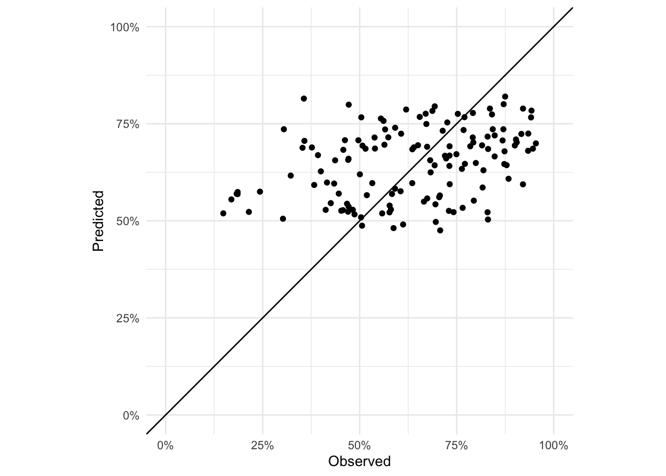
Exercise: Plot the residuals of the GLMM model. Are they IID? NB: you will have to use the residuals and fitted values on the link (logit) scale.
adm2 %<>% mutate(residuals_glmm = residuals(adm2_binom_glmm$lme))

ggplot(data = adm2,
       aes(x = predicted_logit,
           y = residuals_glmm)) +
  geom_point() +
  geom_smooth(method = 'lm') +
  theme_minimal() +
  xlab('Fitted values (logit scale)') +
  ylab('Residuals (logit scale)')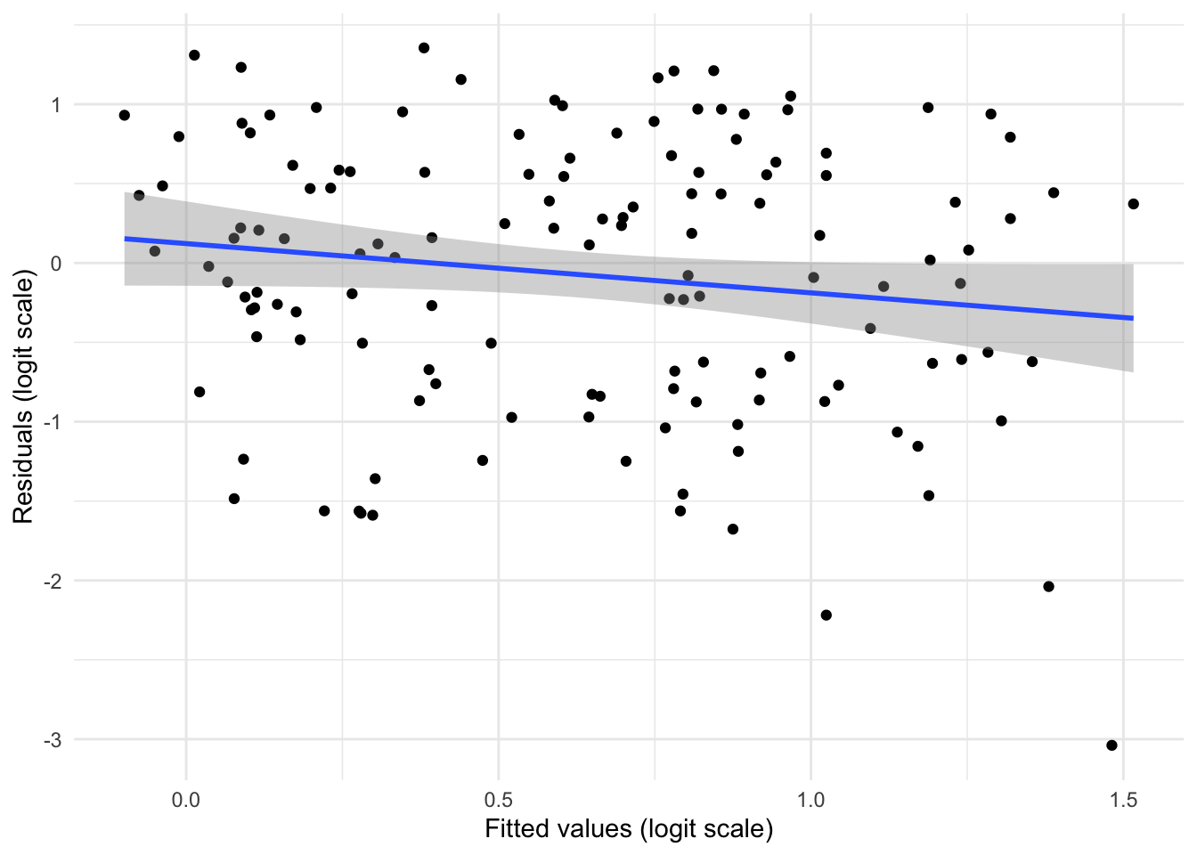
Model comparison
Exercise: Is the GLMM or GLM better for modelling this data? Ensure you give reasons related to the statistical modelling.
GLMM is better, which you can see by extracting the AICs but also from looking at the residuals which not only show smaller vertical spread but look more IID
Predicting
Exercise: Make a plot of the predicted vaccine coverage from the GLMM.
ggplot(data = adm2) +
  geom_sf(aes(fill = predicted),
          color = NA) +
  scale_fill_continuous(name = 'Predicted\nvaccine\ncoverage',
                        type = 'viridis') +
  theme_minimal()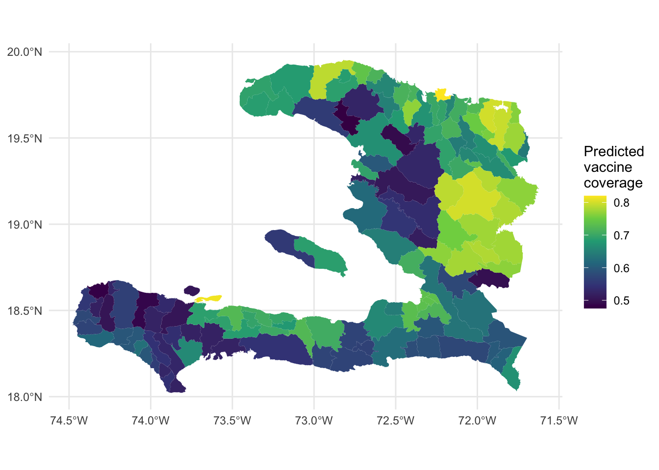
Extensions
Extension exercise: Fit a GLMM with a random intercept on the level 2 administrative region effect instead of on level 1. What happens to the predictions? Why?
adm2_binom_glmm2 <- gamm(data = adm2,
                        cbind(vacc_num, vacc_fail) ~ urbanpct,
                        family = binomial(),
                        random = list(adm2_en = ~1))
##
## Maximum number of PQL iterations: 20adm2 %<>% mutate(fitted_adm2 = boot::inv.logit(fitted(adm2_binom_glmm2$lme)))
ggplot(data = adm2,
aes(x = vacc_num/vacc_denom,
y = fitted_adm2)) +
geom_point() +
ylab("Fitted") +
xlab("Observed") +
theme_minimal() +
coord_equal() +
geom_abline(slope = 1, intercept = 0) 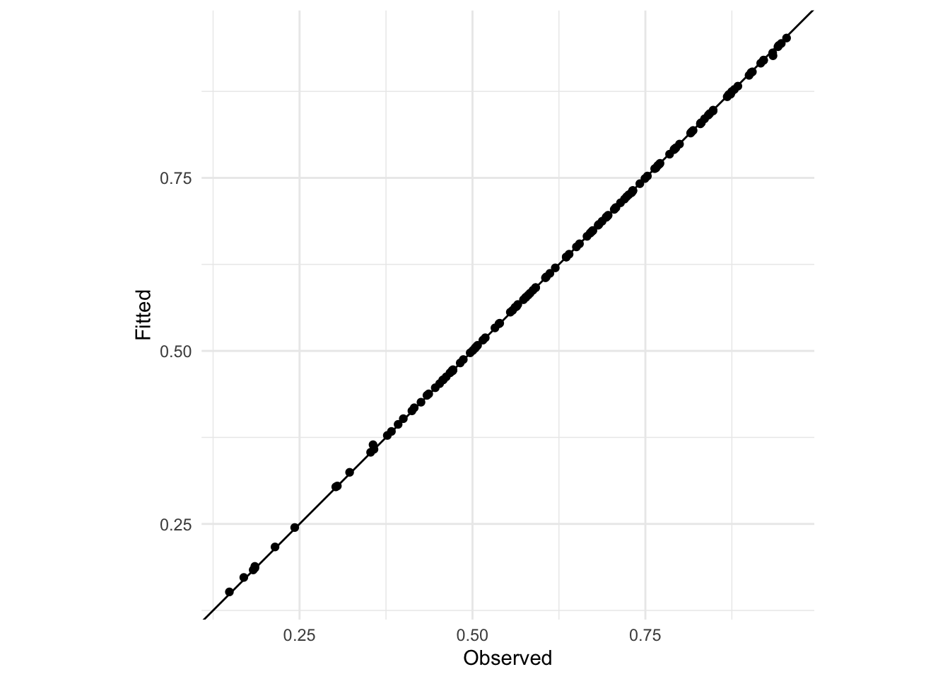
The predictions are all more or less on the 1:1 line because there’s only one observation per arrondissement and so there’s enough degrees of freedom in the model to fit perfectly (subject to the method used to fit the model)
Extension exercise: For the rat model we investigated random effects for both the intercept and slope. Explain whether it would make sense to do a random slope for the effect of urbanicity.
It probably doesn’t make sense because it represents an assumption that the effect of urbanicity changes from department to department. It miiiiiight make sense if we assume that each department has different challenges in reaching the rural population that aren’t able to be captured with a random intercept. We must challenge the idea that we can just keep adding random effects to improve model fit.